
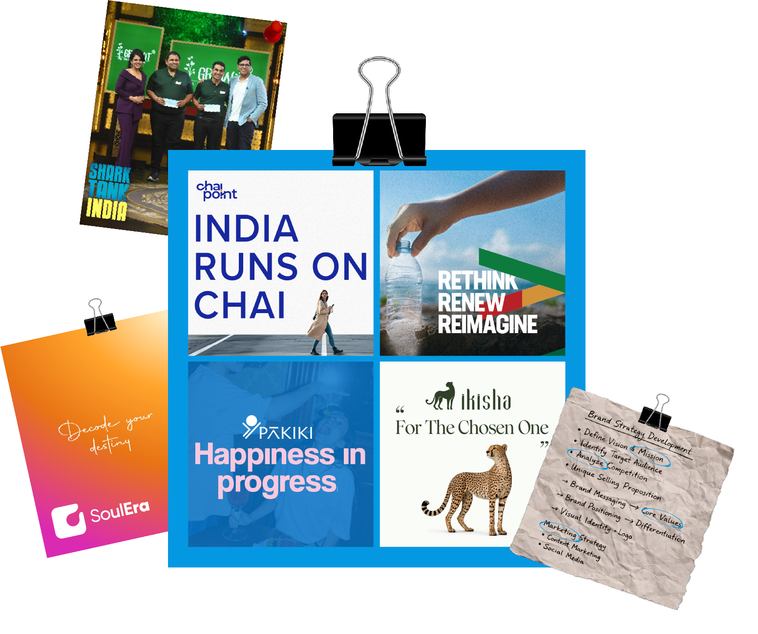

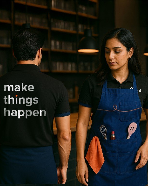
CHAI POINT
As India’s largest chai-led beverage platform, Chai Point operates at the intersection of culture, habit, and scale. The task was not a cosmetic refresh, but clarification. To define a contemporary brand idea that could carry this scale with co- herence and speak to a new generation of Indians.
We began with a deep audit of the brand, the category, and the cultural context around chai. While chai is emotionally in- grained, the category has largely positioned itself around comfort and pause. The space of stimulation and collective-ness remained largely unexplored, presenting an opportunity to reframe chai as a catalyst for energy, momentum, and shared progress.
India today is purpose-driven and in motion. People are building, striving, and showing up every day. Chai Point is part of this rhythm, fuelling conversations, ideas, and action across cities and moments. This insight led to the po-sitioning Fueling India’s aspirations, one cup at a time, with Make Things Happen as the rallying thought.
The strategy translated into a cohesive, scalable brand identity system designed to work across physical and digital environments. From logo to language, the brand was rebuilt to feel energised, modern, and collective, elevating Chai Point from functional familiarity to cultural relevance.

THRYL
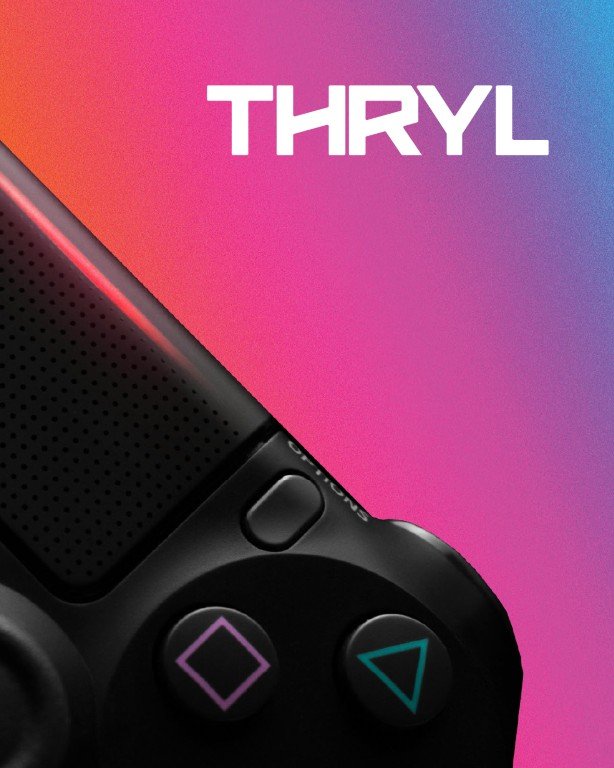
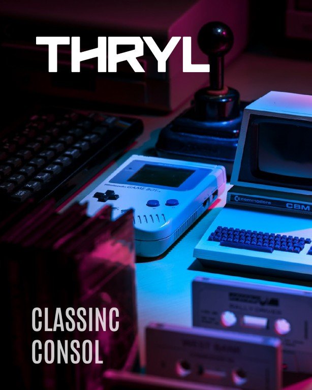
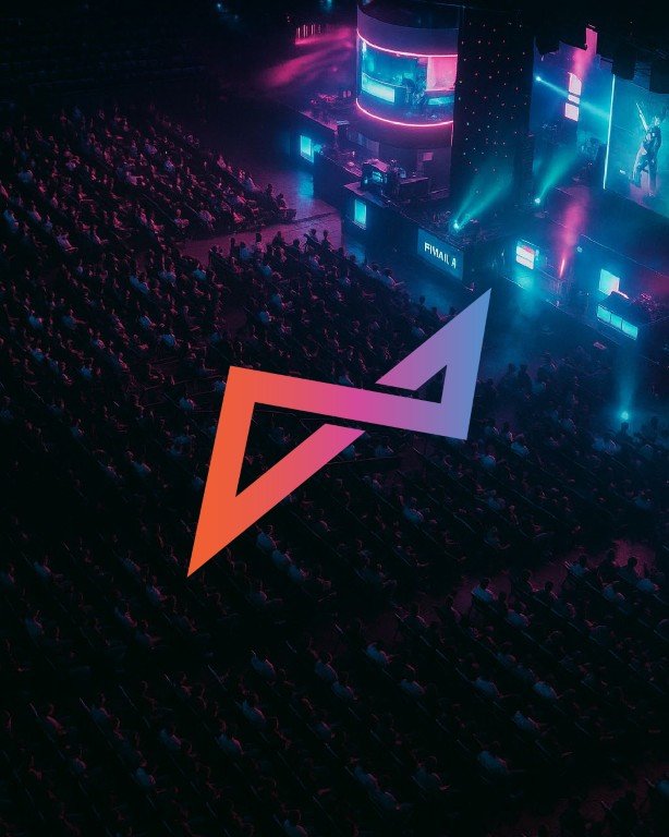
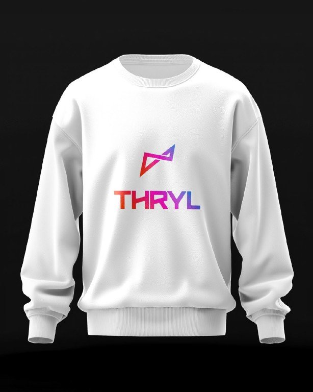
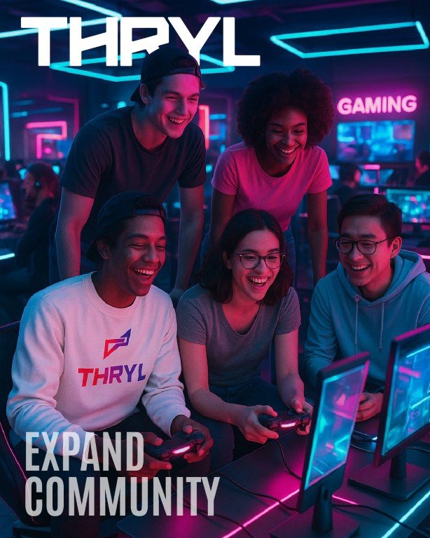
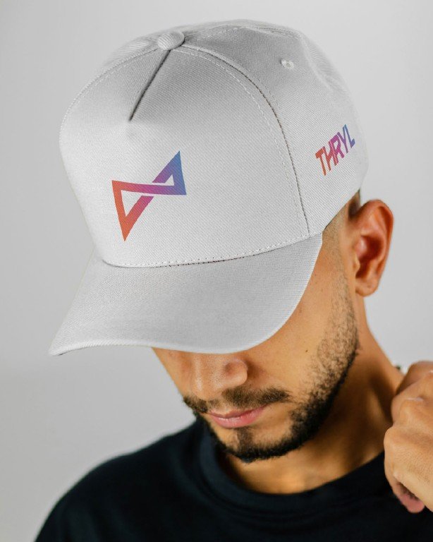
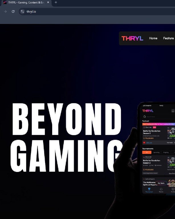
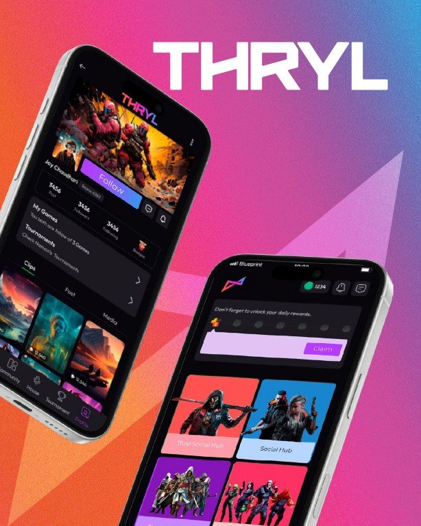
Thryl is an emerging esports platform built to connect gamers, communities, and competitive play in a fast-moving digital culture. From the outset, the challenge was not just to create a logo, but to build a brand that could live in motion, scale across platforms, and resonate with a highly expressive, always online audience.
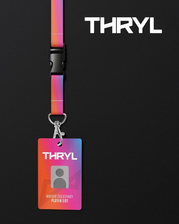
The identity was developed as a flexible system rather than a fixed asset. Designed for motion-first environments, it brings structure to speed and coherence to expression, allow-ing the brand to adapt across digital, social, merchandise, and live contexts without losing clarity. The result is a brand designed to perform wherever Thryl appears and to evolve alongside the culture it belongs to.


JBrPET
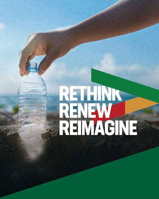
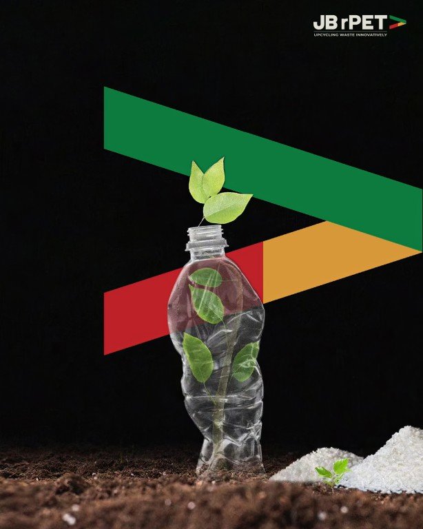
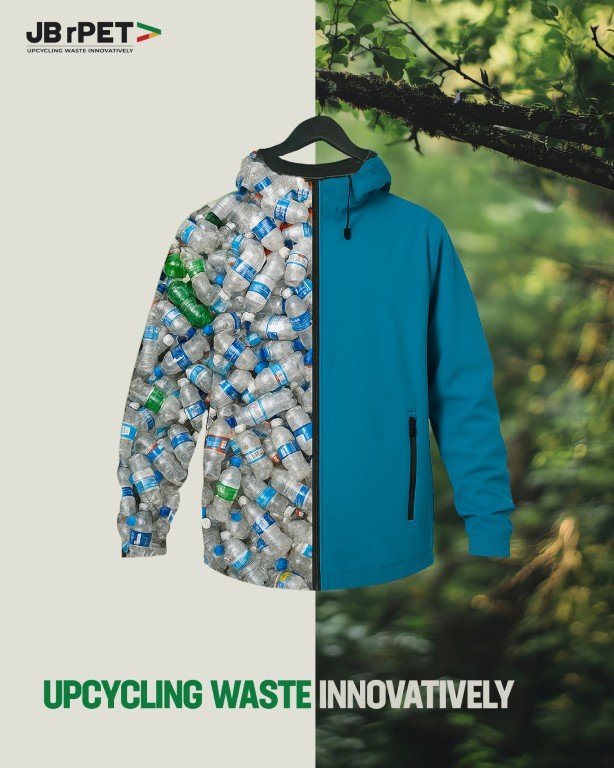
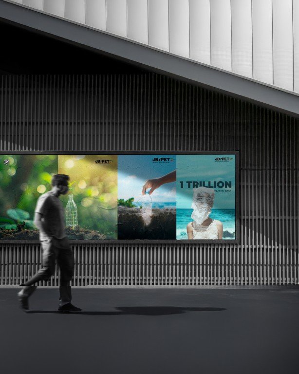
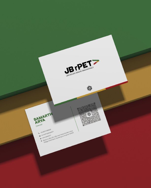
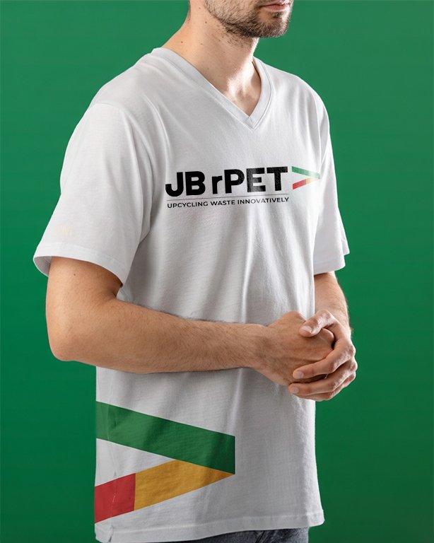
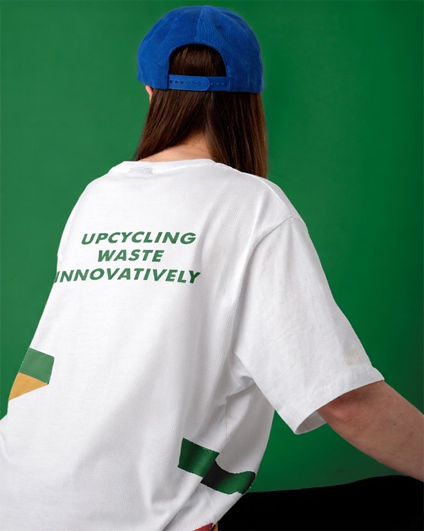
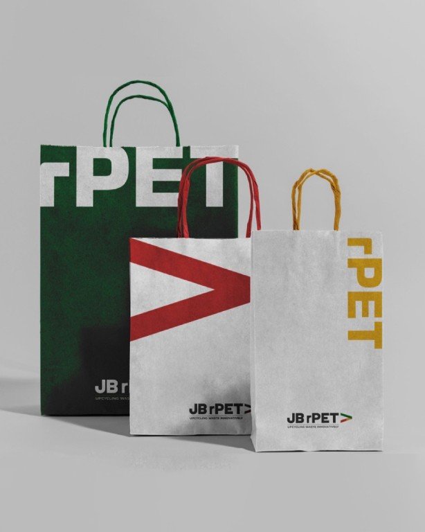
A global-facing brand identity for a B2B sustainability company redefining how plastic waste is valued. JBrPET operates in the circular materials space, upcycling post-consumer plastic waste into rPET resins for packaging and textile applications. While the business was creating measurable impact, its brand presence did not fully reflect the scale, credibility, or ambition required to compete in global markets.
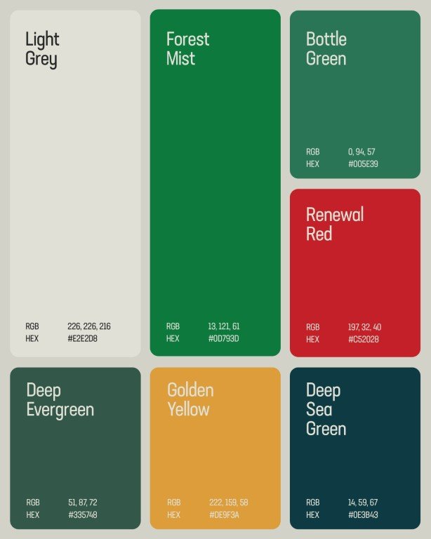
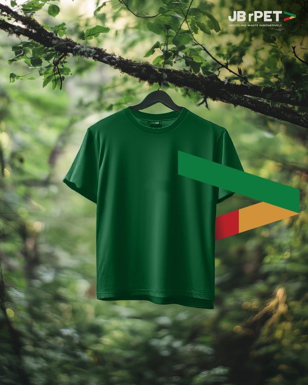
Our work focused on building a clear, confident brand system that signals progress without losing authority. Anchored in the “greater than” symbol, the identity expresses advancement, responsibility, and a commitment to going beyond conventional recycling. The result is a structured, modern brand language designed to resonate across global B2B and sustainability-focused audiences.


Batsons
A visual identity refresh for a legacy textile brand stepping into its next chapter.
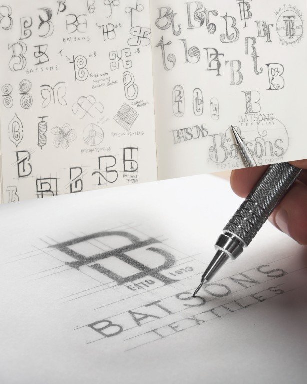
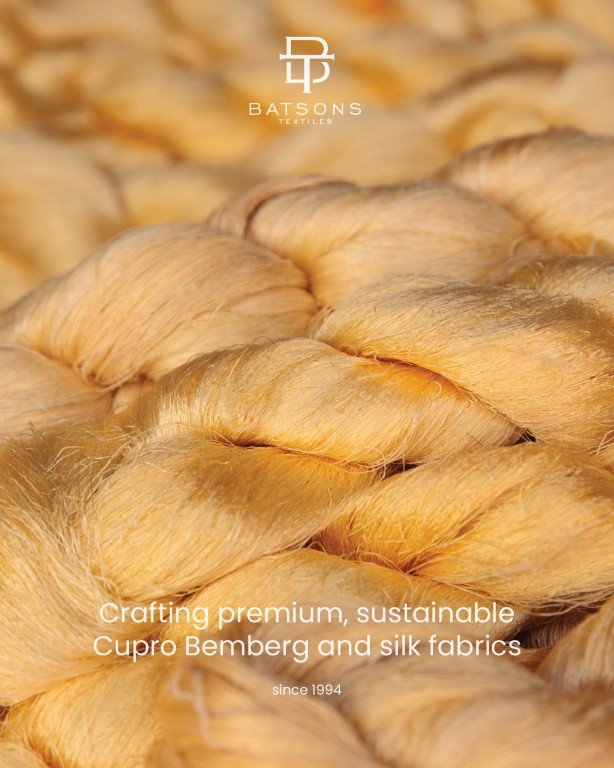
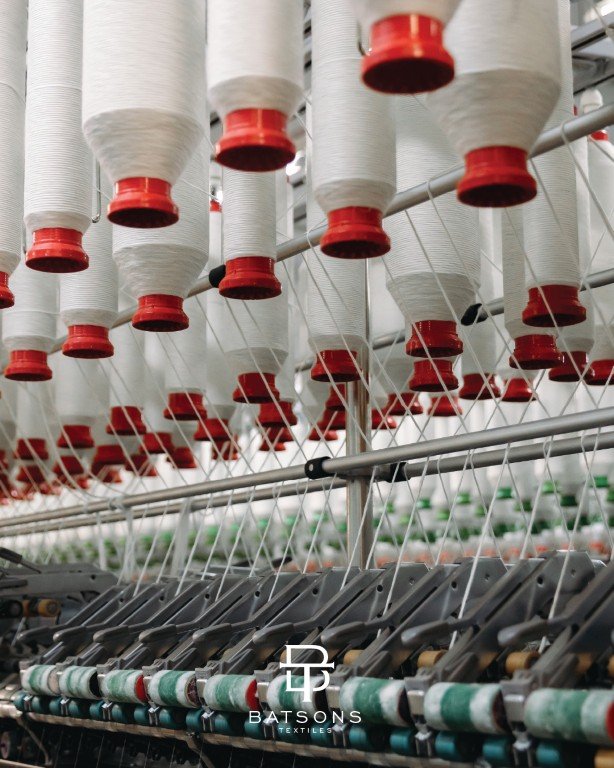
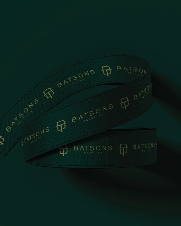
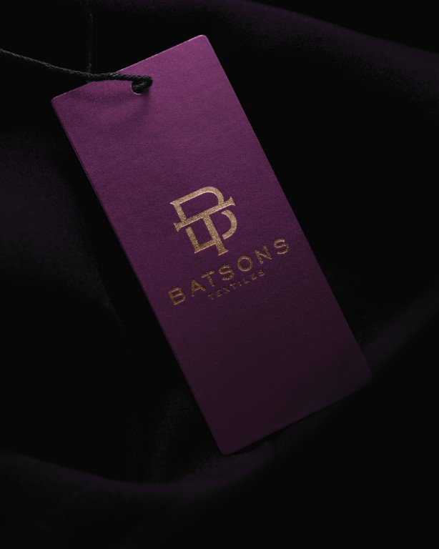
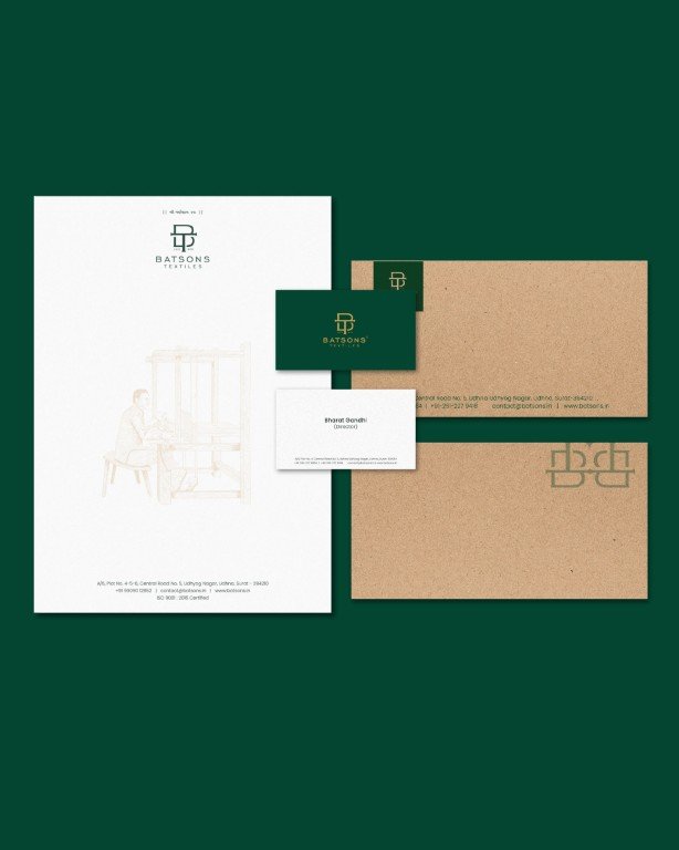
Batsons Textiles has spent over three decades building trust in premium Cupro Bemberg fabrics. The brief was clear to modernise the brand without erasing the equity built through time, craftsmanship, and consistency.
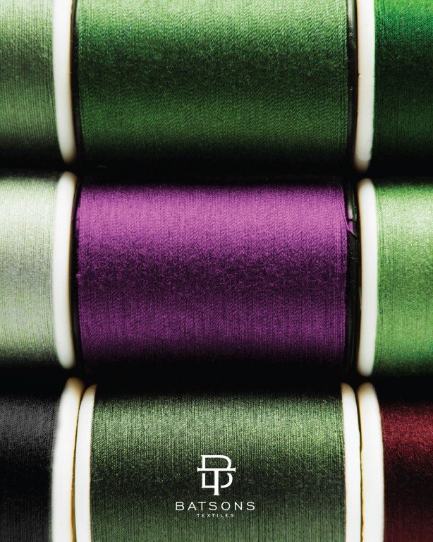
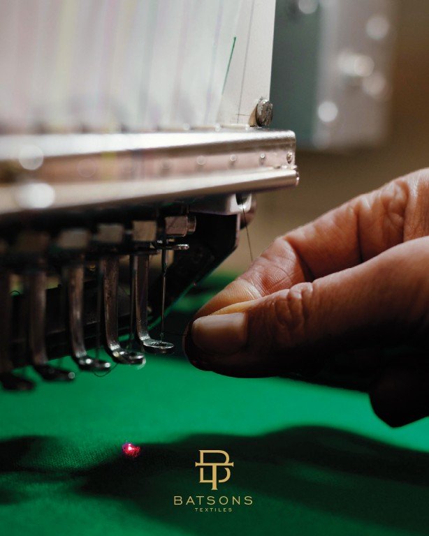
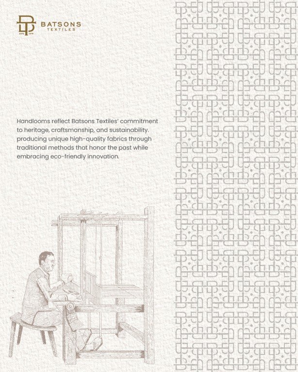
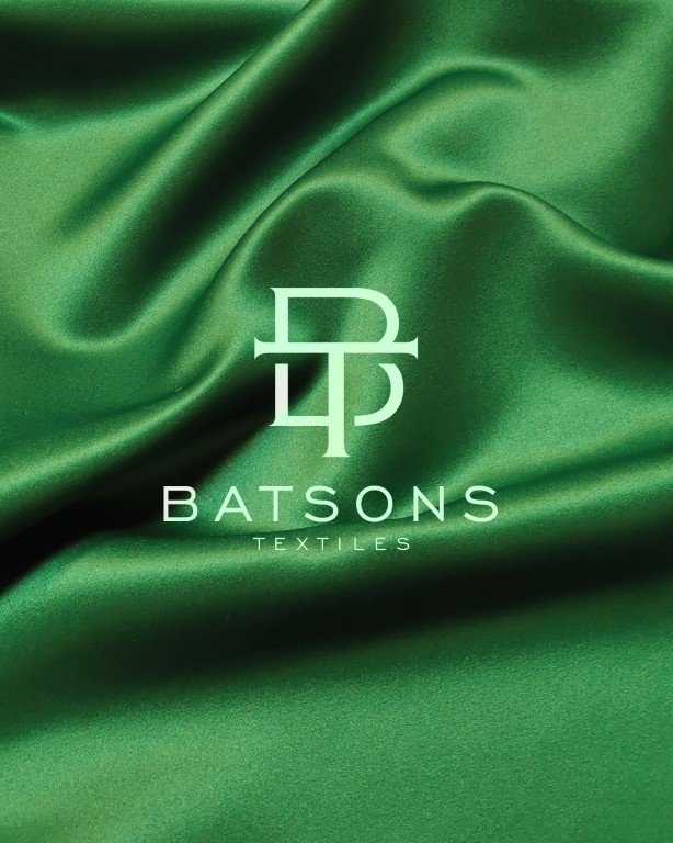
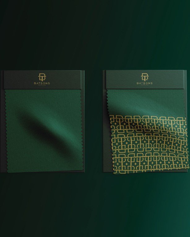
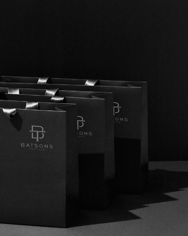
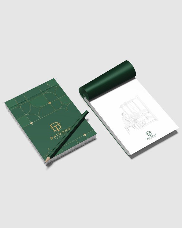
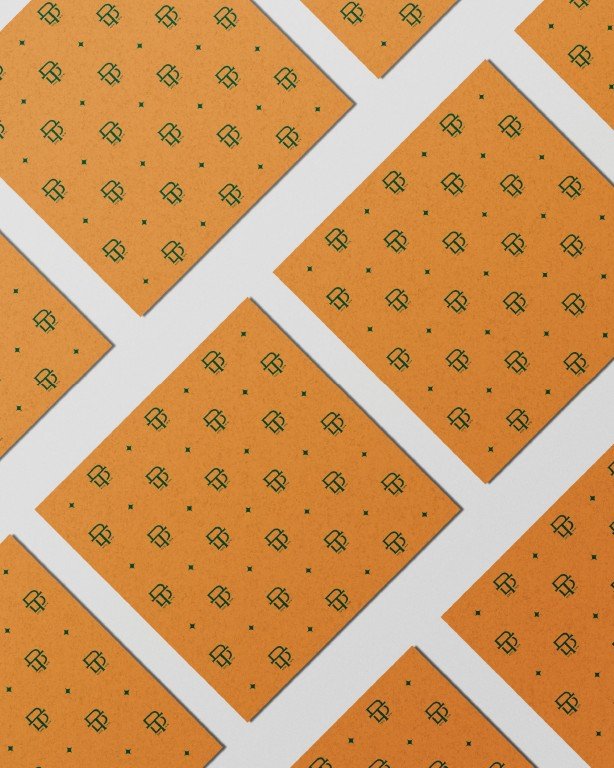
We began by distilling what needed to remain and what needed to evolve. The refreshed identity simplifies form while retaining structure and authority. Built on principles of precision, continuity, and craft, the redesigned logo brings clarity and restraint to the brand. A refined typographic system and a controlled colour palette lend Batsons a contemporary, global presence without losing its sense of heritage.
The result is an identity that feels future-ready, grounded in the confidence of a brand that knows where it comes from.

Ikisha
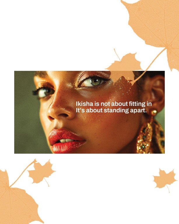
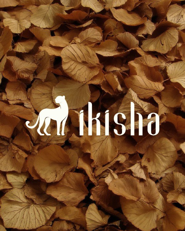
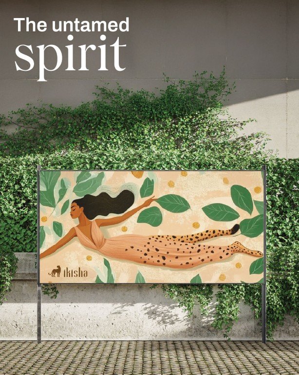
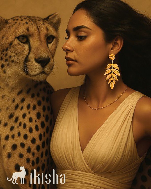
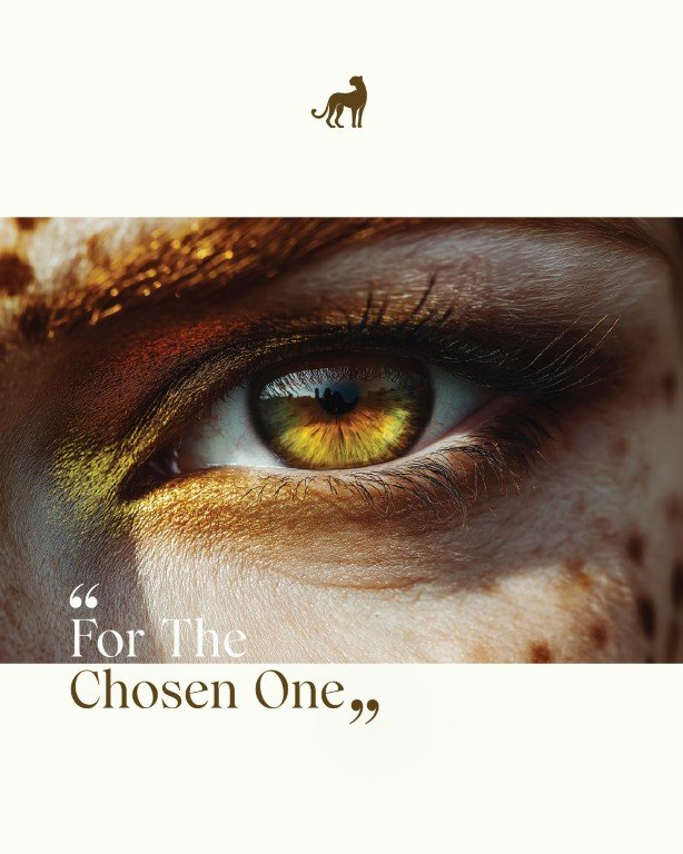
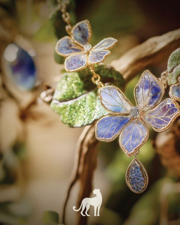
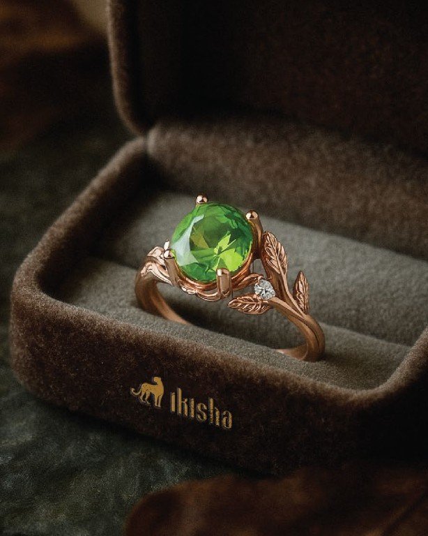
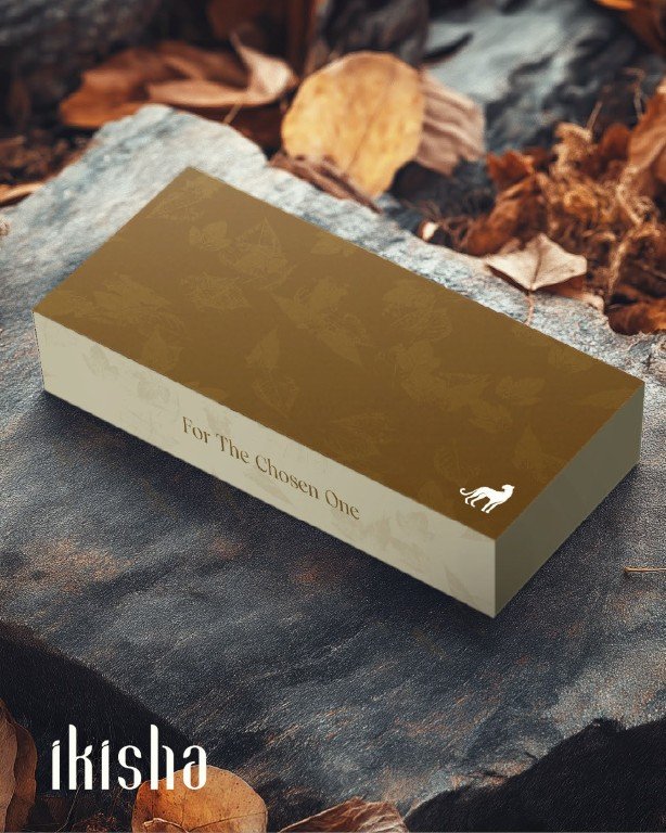
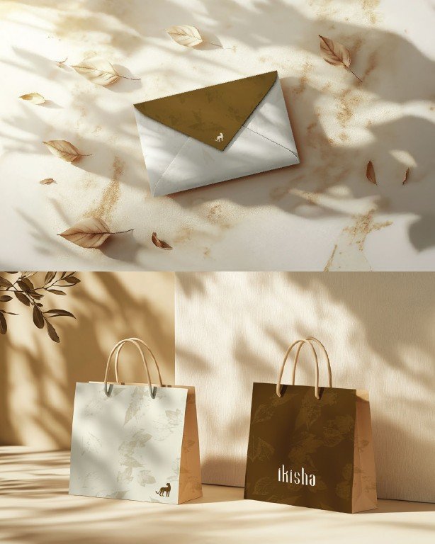
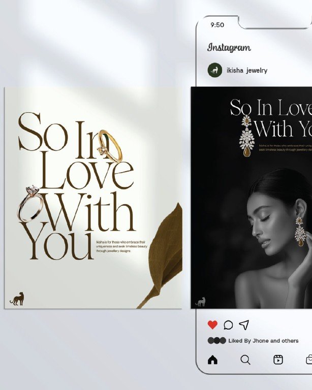
Ikisha was conceived as a complete brand world, not just an identity. Beginning with naming, the idea was to define a woman who is whole in herself, self-possessed, instinctive, and beyond the category’s usual definitions of beauty and delicacy. The name Ikisha, meaning one divine goddess, set the foundation for a brand rooted in self-belief rather than ornamentation.
This thinking shaped the visual language. The cheetah, calm, composed, and alert, became the central symbol. Chosen for its quiet power rather than speed, it reframes strength as instinctive and controlled, challenging the jewellery industry’s long-standing visual codes of fragility.
Every element, from typography to iconography and application, was designed to function as a unified system. The result is a bold, contemporary jewellery brand where design, meaning, and expression move together.

Soulera
A visual identity refresh for a legacy textile brand stepping into its next chapter.
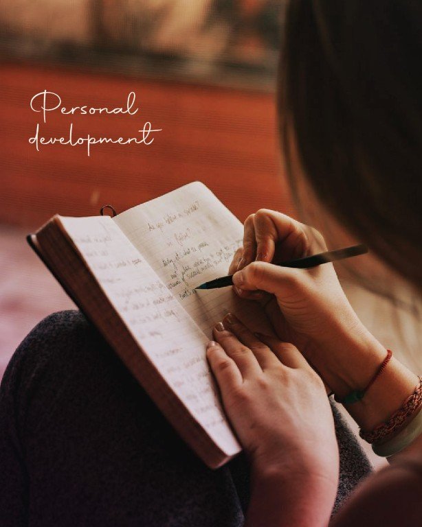
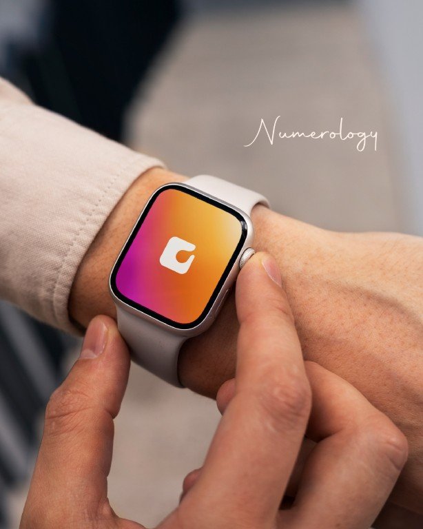
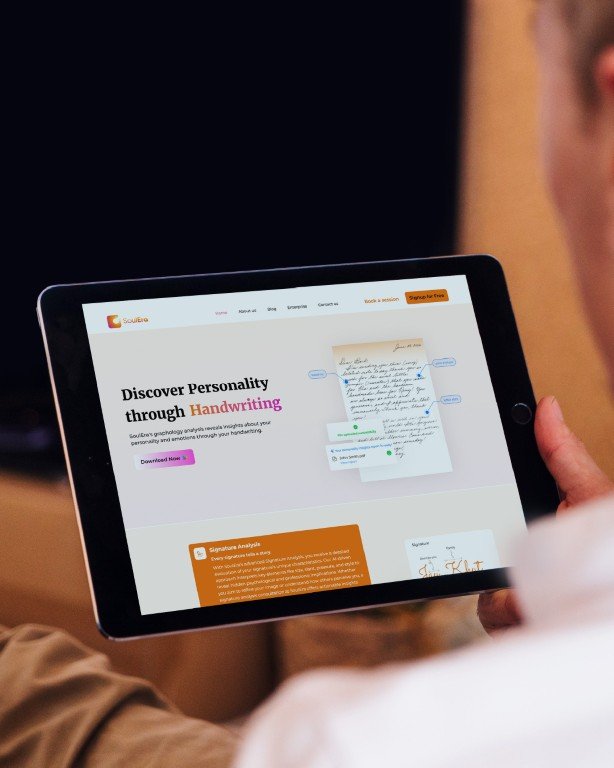
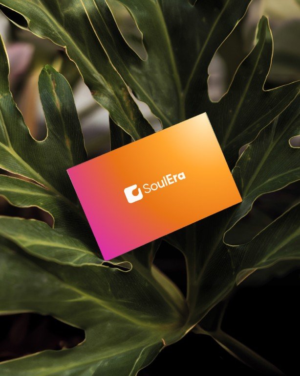
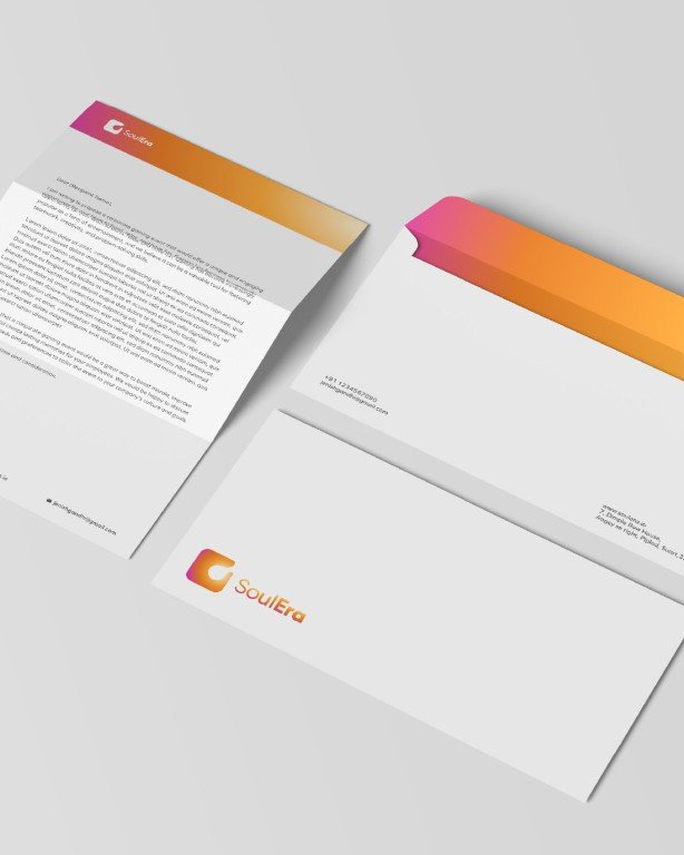
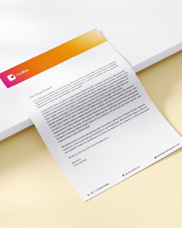
Soulera was conceived as a system for self-understanding, using handwriting analysis and AI as tools for reflection rather than prediction. The challenge was to shape a brand that could hold depth and technology without feeling heavy, clinical, or overwhelming.
The name Soulera brings together two ideas. Soul as an internal guiding force, and era as a moment of transition. It frames the platform as a personal threshold where clarity begins to take shape. This idea of moving from uncertainty to alignment became the foundation for the identity.
The visual language reflects this journey. Structure, motion, and form are designed to feel measured and intentional, supporting focus rather than distraction. Every element works to reduce friction and create space, allowing the experience to feel calm, navigable, and considered.
The result is a brand that does not explain to the user but quietly supports reflection and understanding.





Sukuun
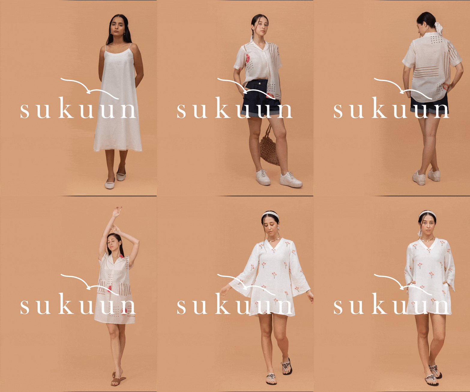
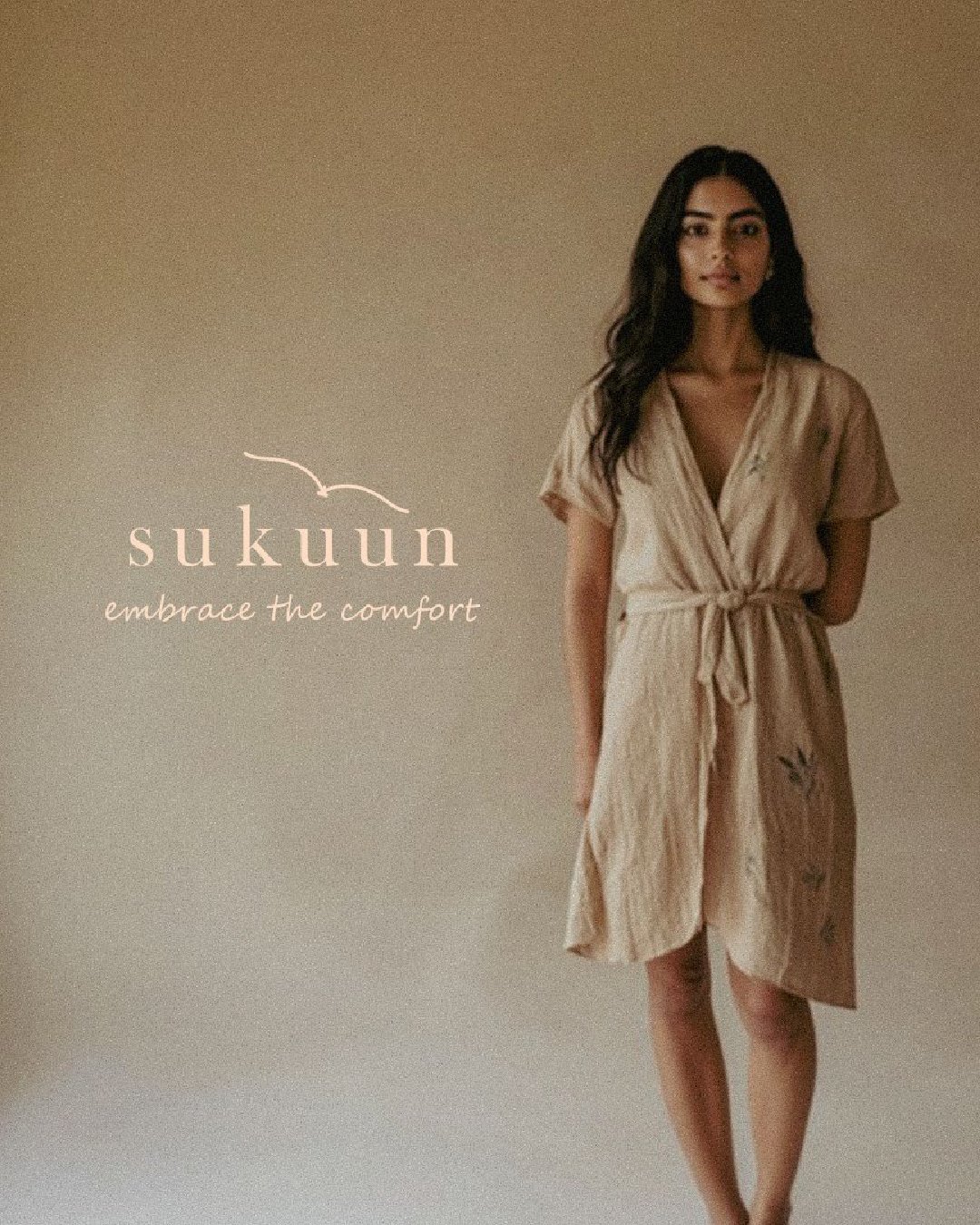
A brand identity for a sustainable fashion label built on restraint.
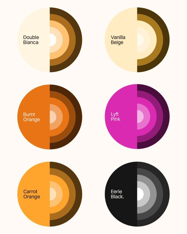
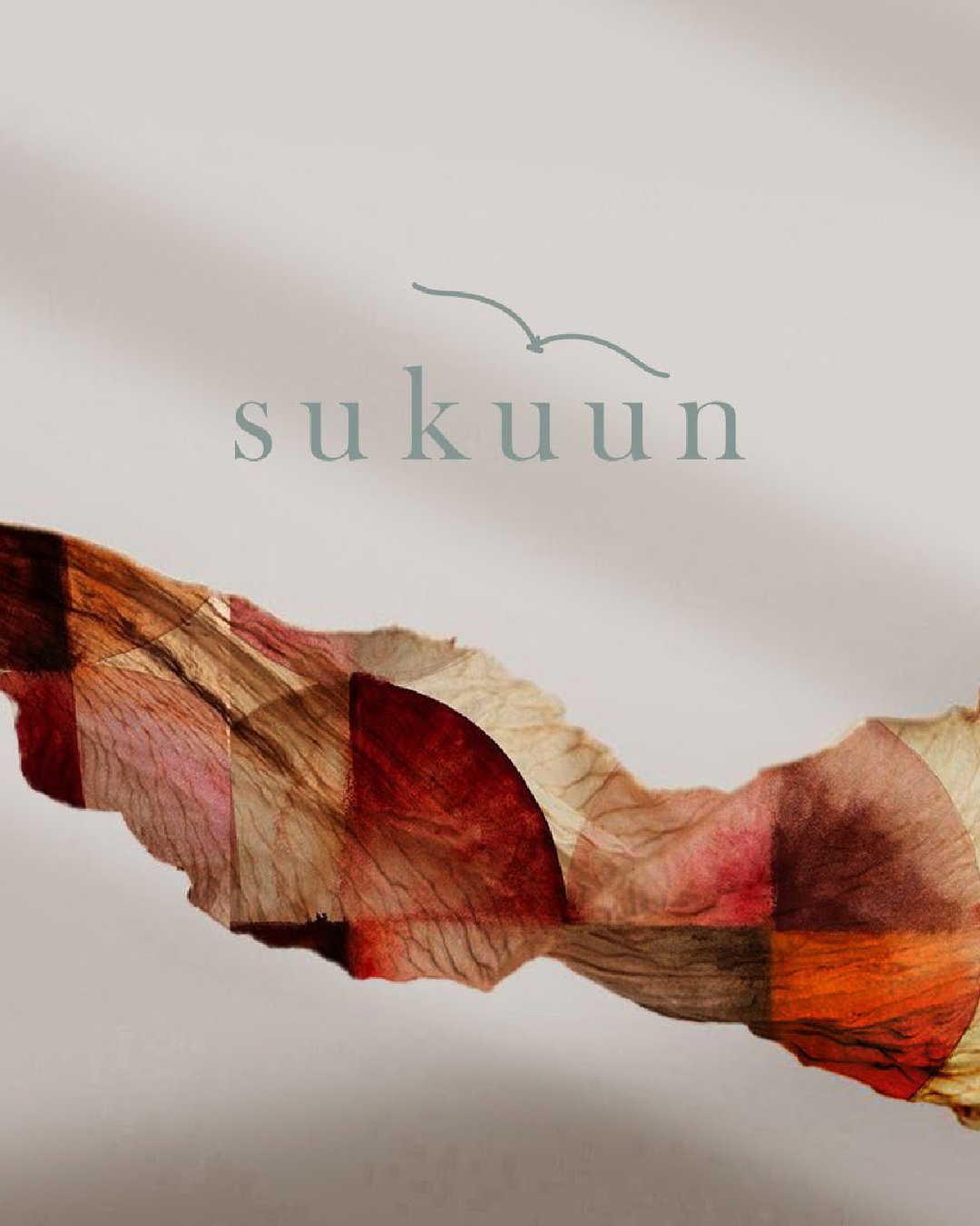
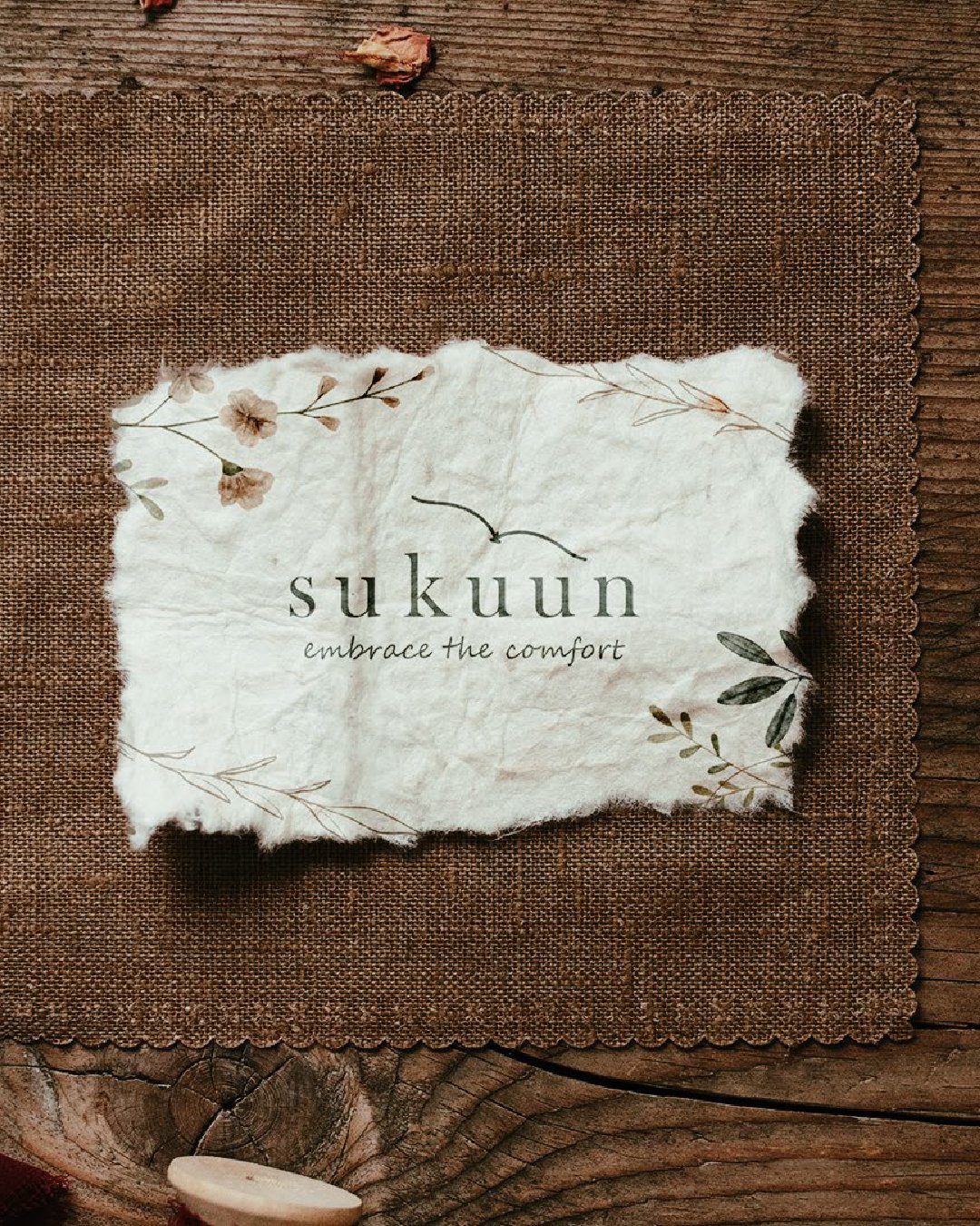
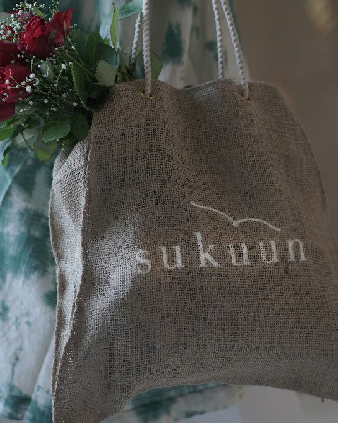
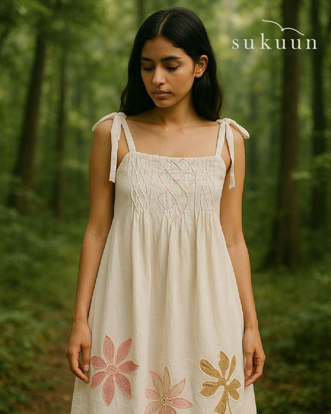
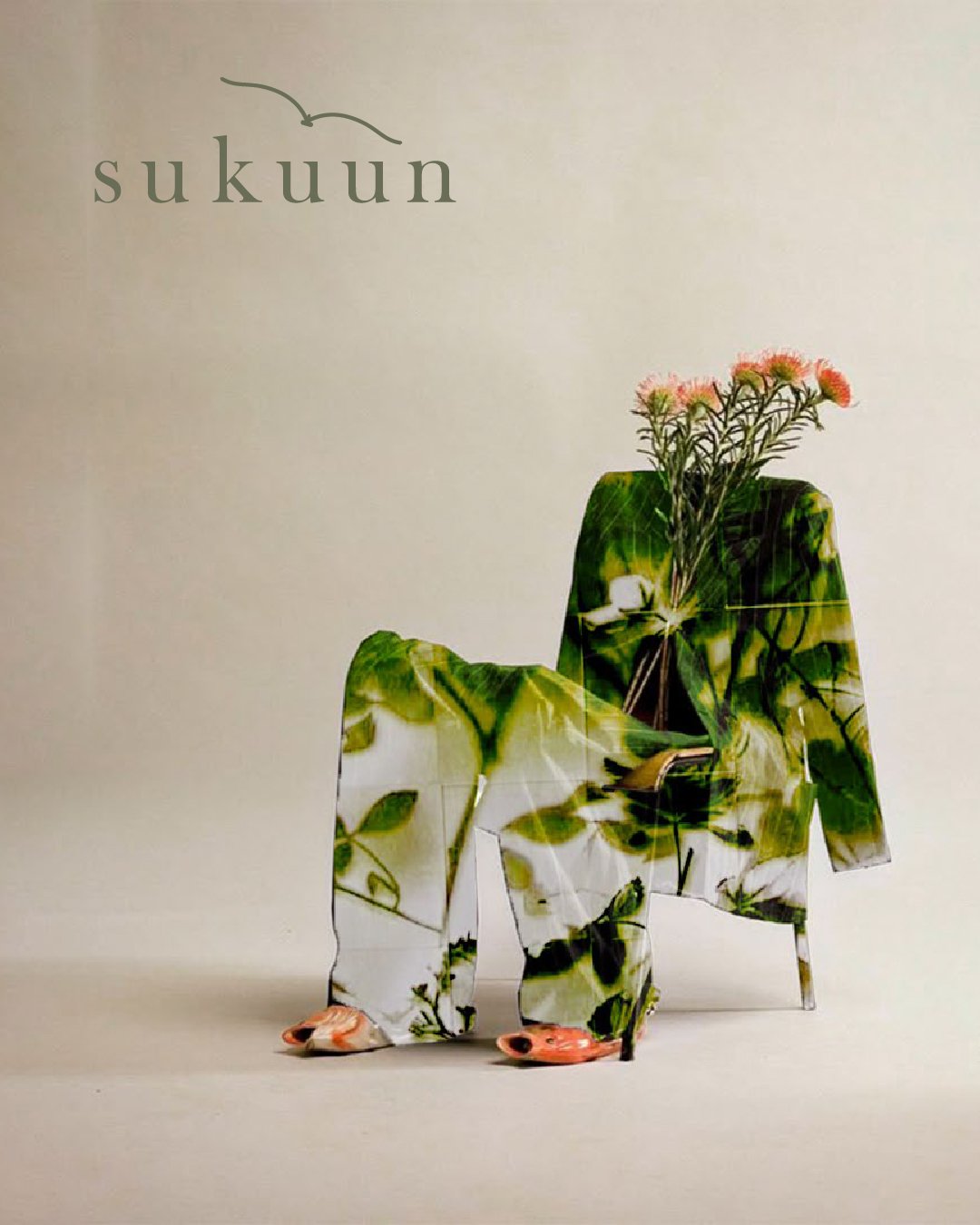
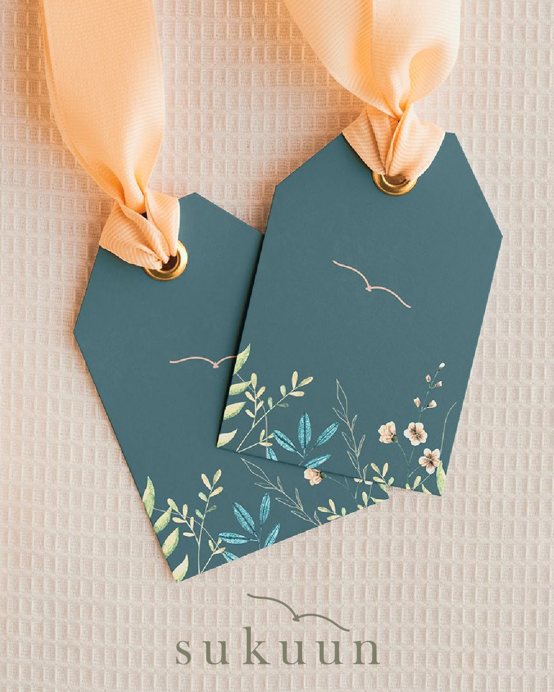
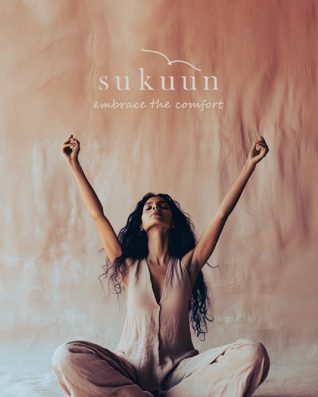
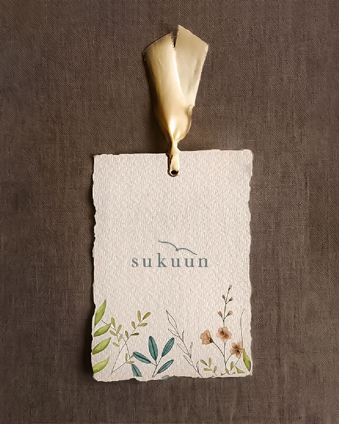
Sukuun is grounded in conscious living, where materials, process, and intent matter as much as the final product. The identity was designed to mirror this mindset: quiet, balanced, and deliberate.
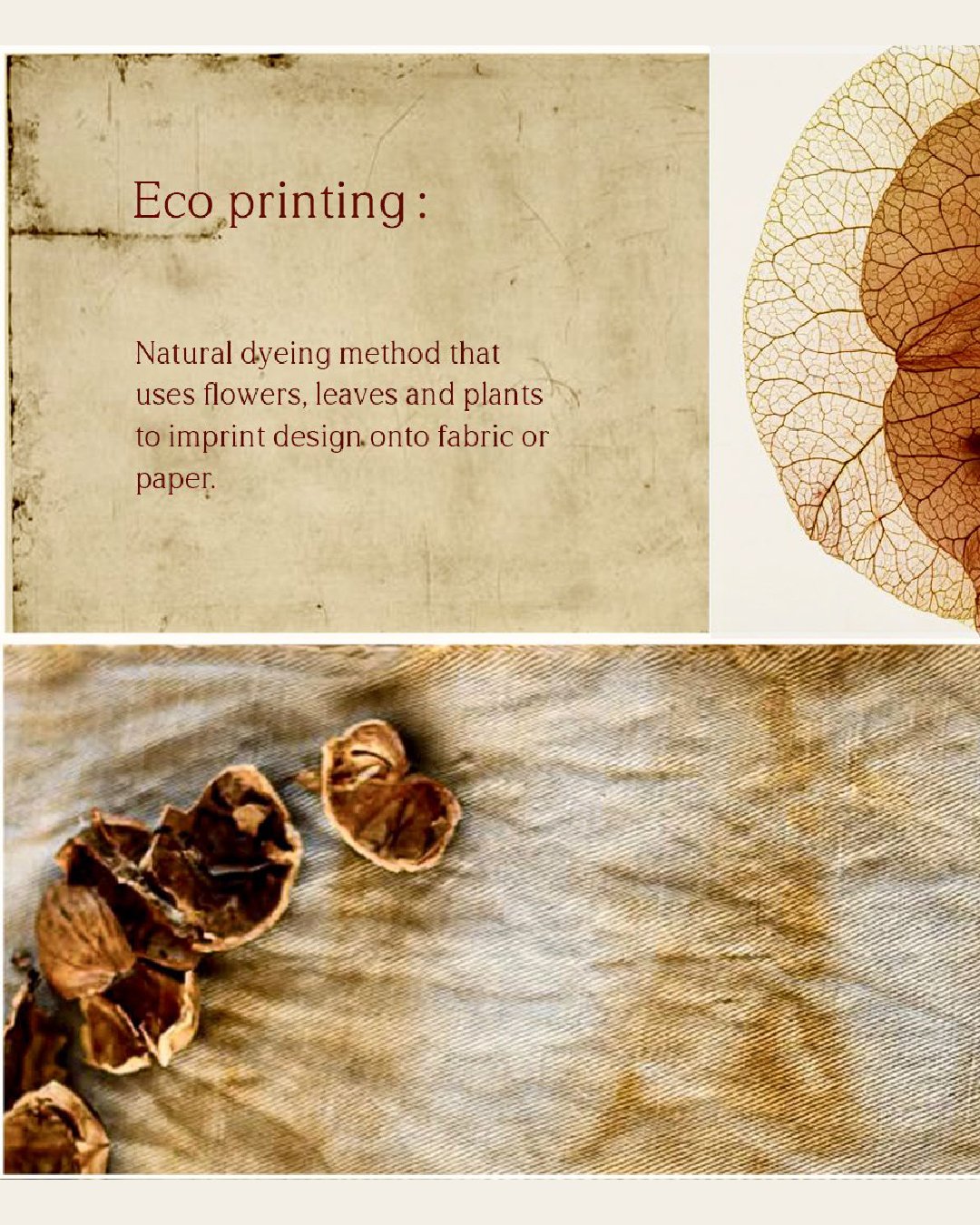
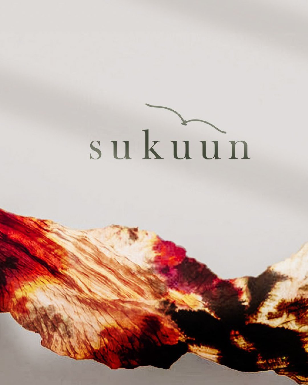
Inspired by natural dyes, plant waste, and organic making processes, the visual language avoids excess. Soft geometry and controlled forms create a sense of calm, while the overall system remains understated and self-assured.
The identity reflects the same restraint and intention that defines the brand itself.
Knitora
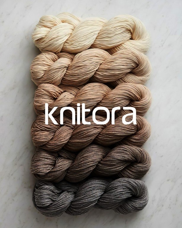
A contemporary brand identity designed to balance clarity with character.
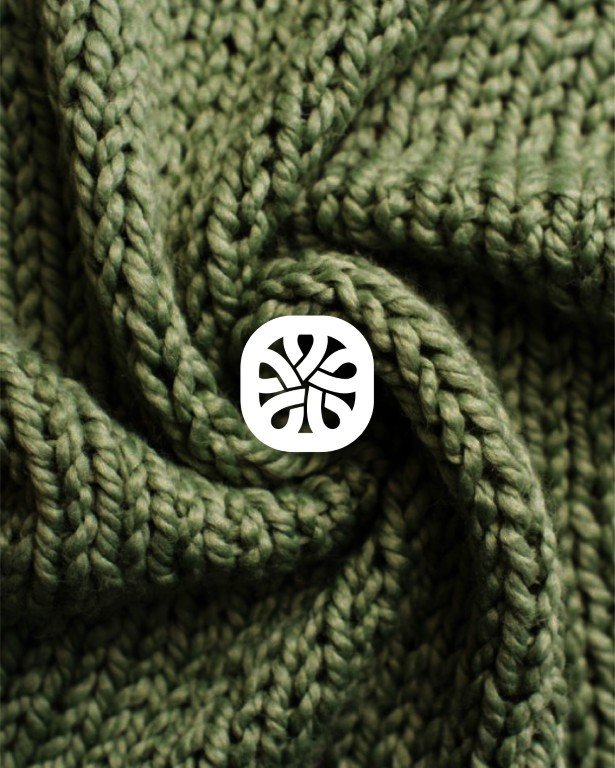
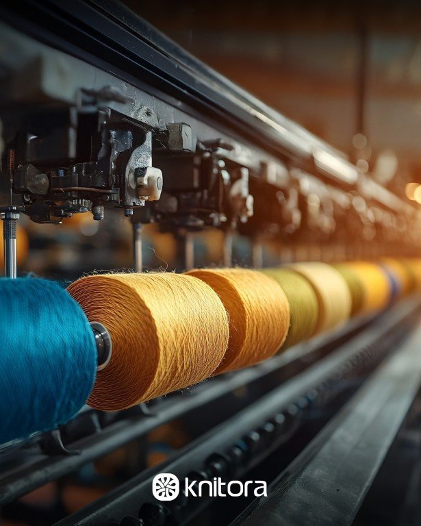
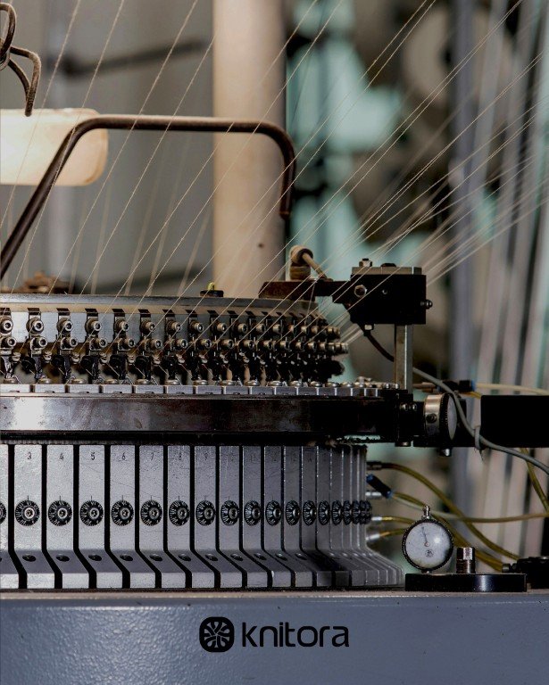
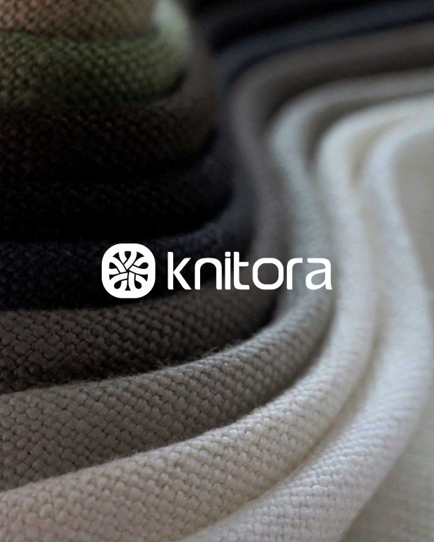
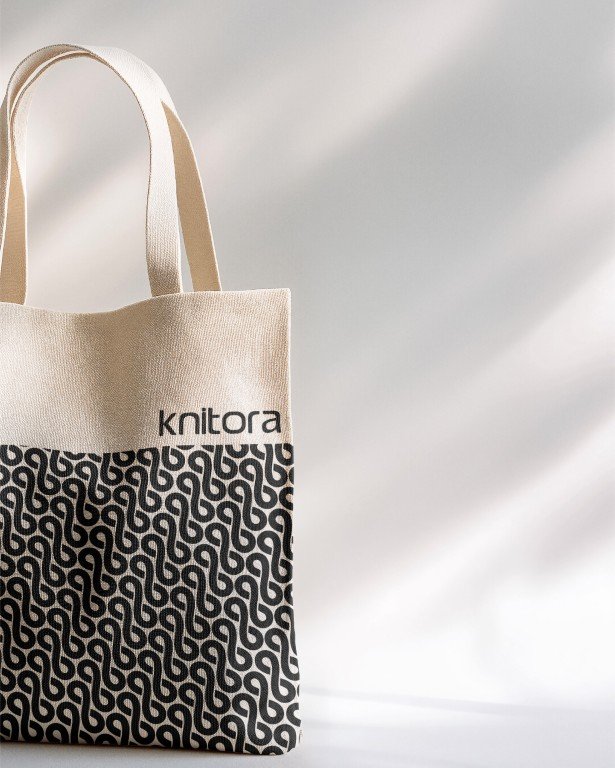
Knitora needed an identity that felt modern and confident, while still signalling care, continuity, and attention to detail. The work focused on distilling these values into a simple, recognisable system rather than relying on decorative cues.
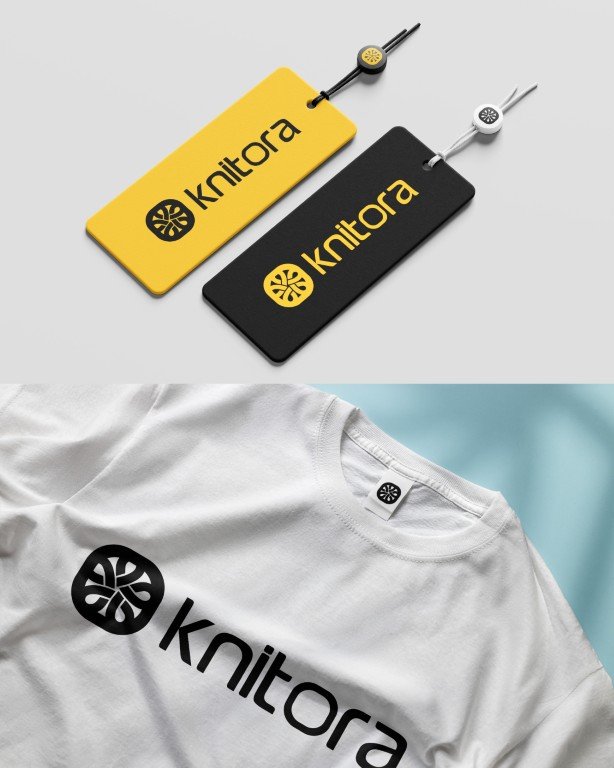
The logo introduces a subtle idea at its core. The letter “O” transforms into a ball of yarn, acting as a quiet reference to origin and making. It is a small intervention, but one that gives the identity depth without overwhelming it. The yellow and black palette adds contrast and energy, ensuring the brand feels bold, visible, and forward-facing.
Together, these elements form a clear, design-led identity that feels contemporary, assured, and built to last.
DERO
A brand identity for a restaurant rooted in pause.
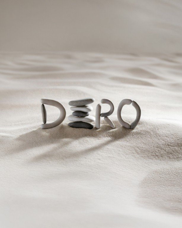
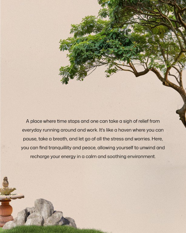
Dero was conceived as a space where time slows and attention shifts. Set within a century-old home, the brand needed to reflect stillness, warmth, and a sense of gathering without feeling curated or performative.
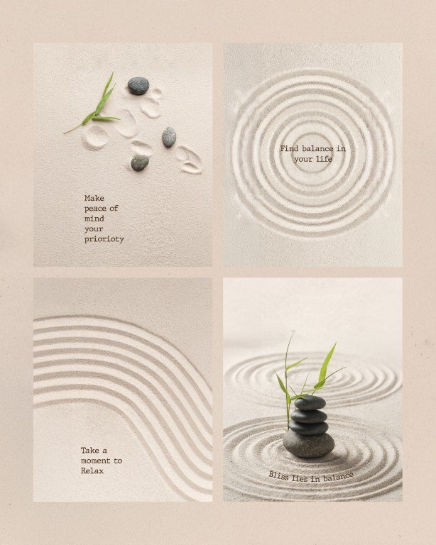
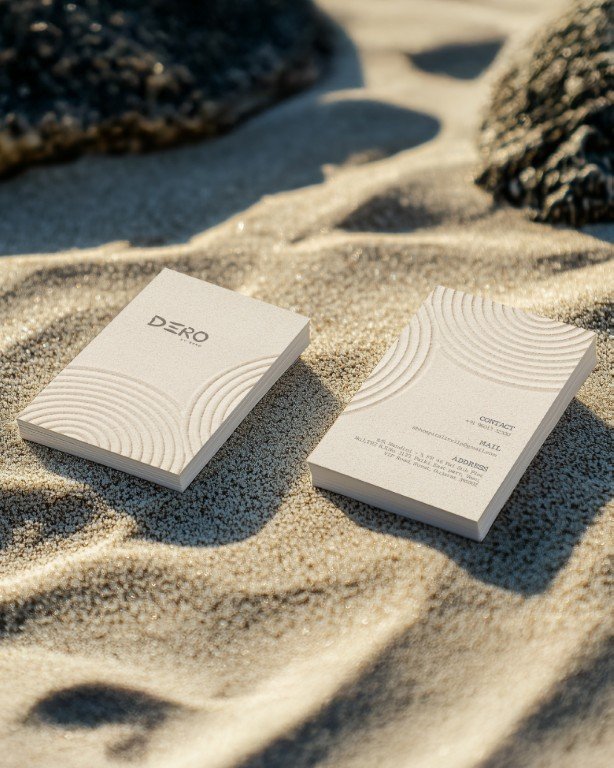
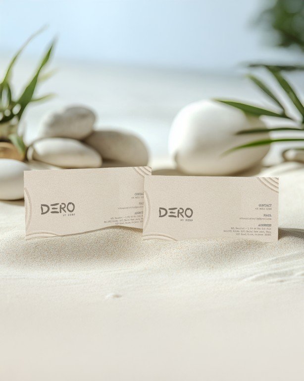
The name Dero, derived from dera, meaning a communal resting place, became the starting point. It framed the brand as open, grounded, and shared. The visual identity draws from principles of balance and restraint, using quiet forms and natural tones to mirror the architecture and allow the space to lead.
Anchored by the idea Where Time Slows Down, the brand is designed to feel calm, cohesive, and considered, supporting the experience rather than defining it.
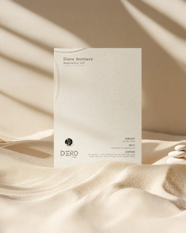
ZERO
The starting point was the name.
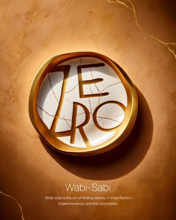
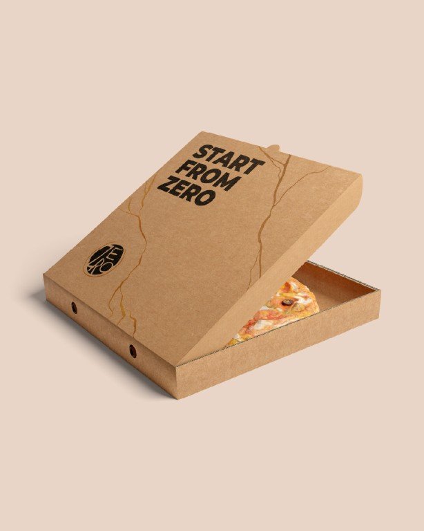
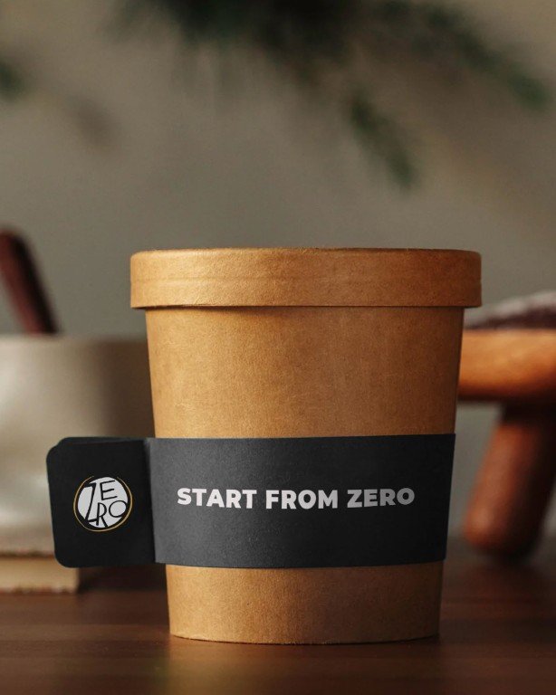
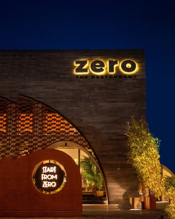
Zero is often associated with absence or failure. We chose to reclaim it as a position of strength, as a point of origin, a reset, and a conscious beginning. Zero wastage. Ground zero. The idea that everything meaningful starts from zero.
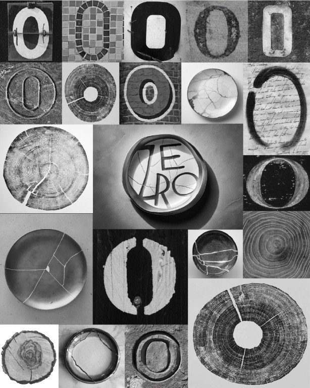
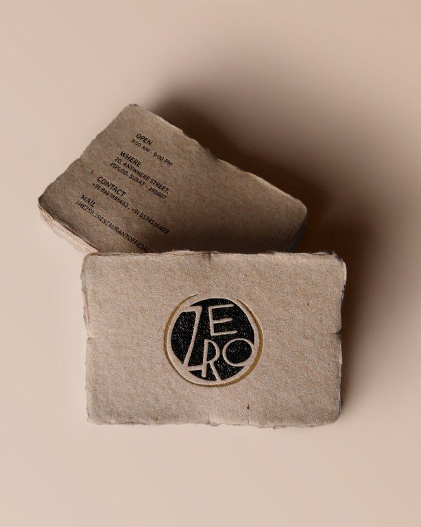
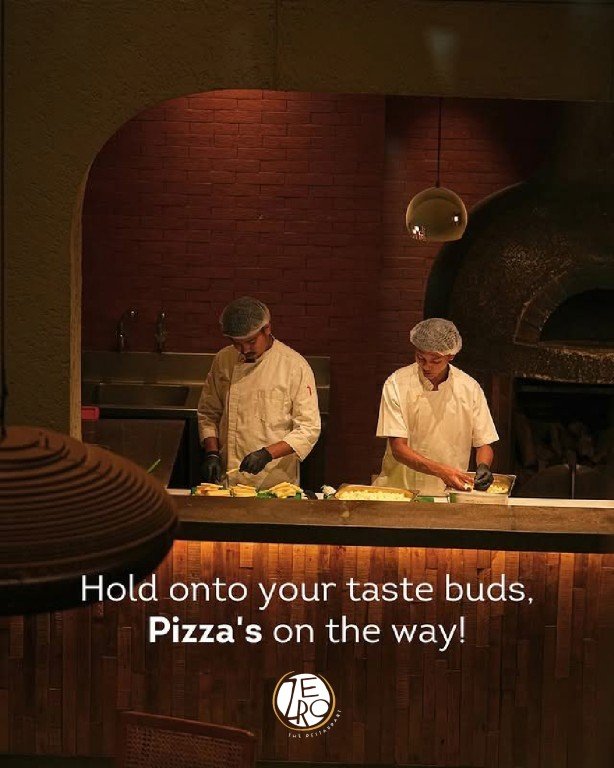
That thinking was grounded in the space itself. Built using reclaimed 100 year old wood from the owners’ ancestral home, the restaurant carried history, wear, and imperfection by default. The brand was designed to honour these qualities, not smooth them over.
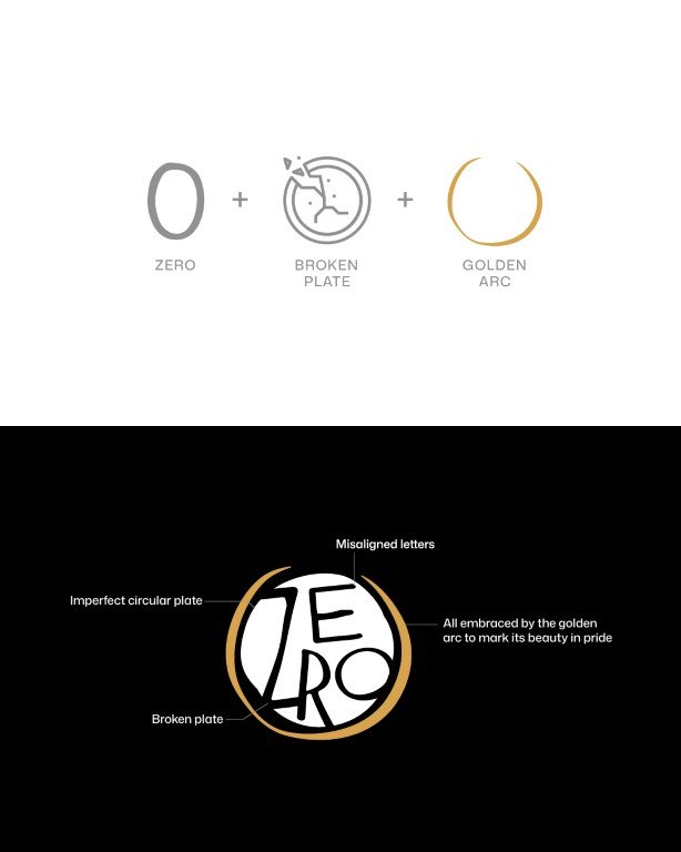
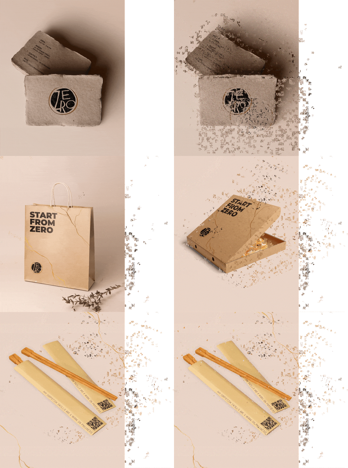
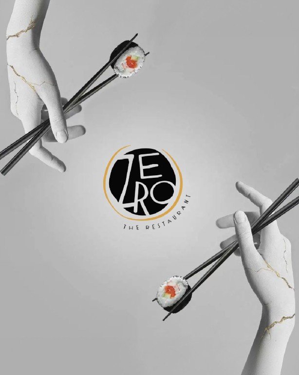
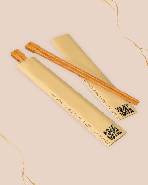
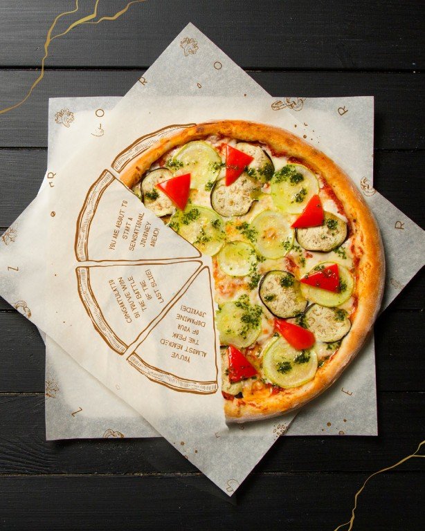
Drawing from the Japanese philosophy of wabi sabi, the identity embraces imperfection as intention. The logo is formed through an imperfect circular plate, broken elements, and deliberately misaligned letterforms, details that are typically corrected or hidden. A golden arc frames these irregularities, not to fix them, but to acknowledge their beauty with pride.
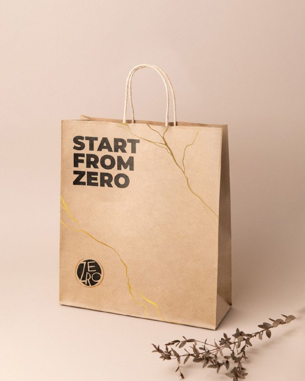
Every decision resists unnecessary polish. Materials, form, and language work together to express restraint, reuse, and honesty. In a category driven by refinement and uniformity, Zero establishes a distinct point of view, one that finds value in what is imperfect and meaning in starting again.
Zero was built by reclaiming the power of zero.


TruPET
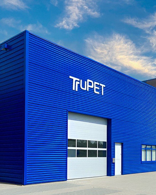
The brand identity for TruPET was developed by grounding it in the fundamental nature of PET itself.
Rather than starting with visual trends, the identity was shaped around PET’s defining characteristics, structure, bonding, and transformation. These principles informed how the brand should look, behave, and scale across industrial and commercial contexts.
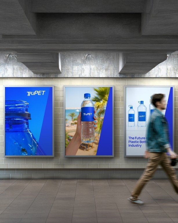
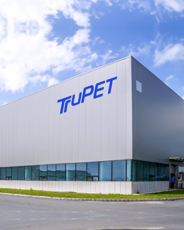
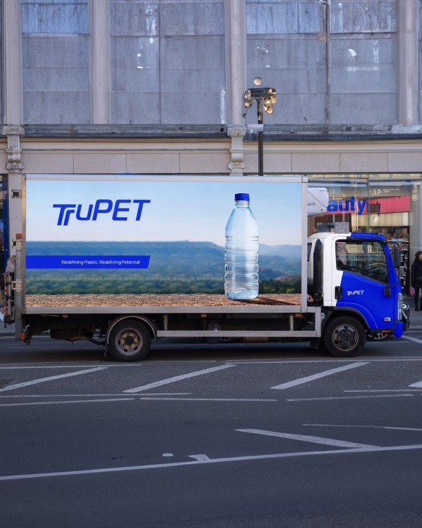
This approach translated into a logo and visual system built on structure and progression. Forms suggest bonding and formation, while upward movement reflects reforming and growth. The system is deliberate and restrained, designed to communicate technical credibility rather than visual noise.
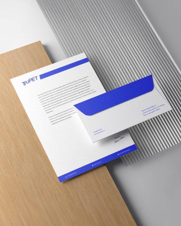
Colour and typography reinforce this positioning. A controlled blue and white palette signals precision, reliability, and material purity, while bold typography brings clarity and authority suited to a B2B industrial environment.
The result is a brand identity that feels considered, credible, and rooted in process, designed to represent material intelligence rather than decoration.







Doodhvale
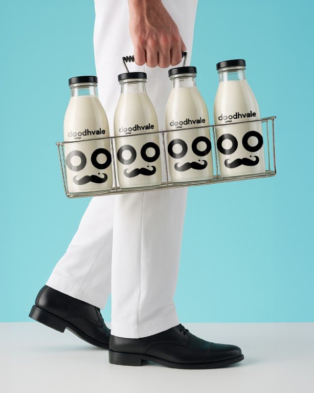
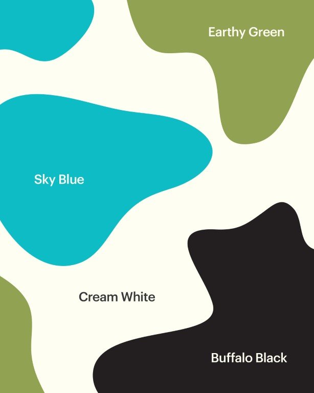
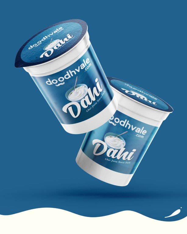
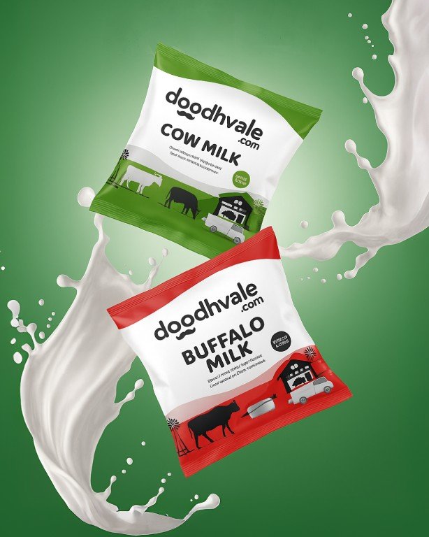
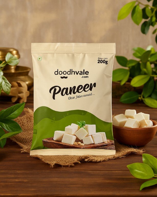
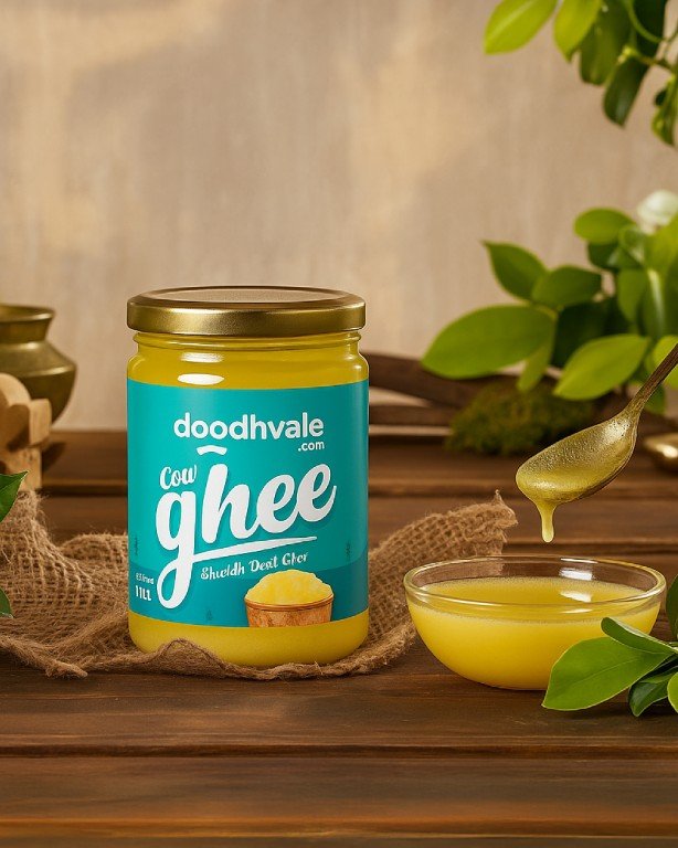
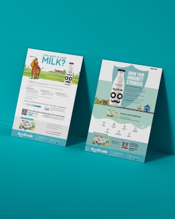
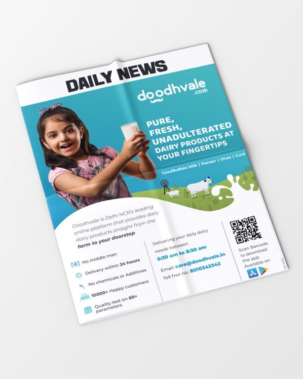
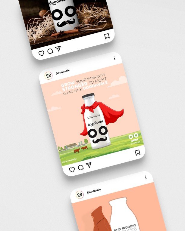
Operating in a category where quality is largely invisible, the identity needed to signal freshness and reliability without explanation. The starting reference was the traditional doodhvala, a familiar figure historically associated with pure, unadulterated milk.
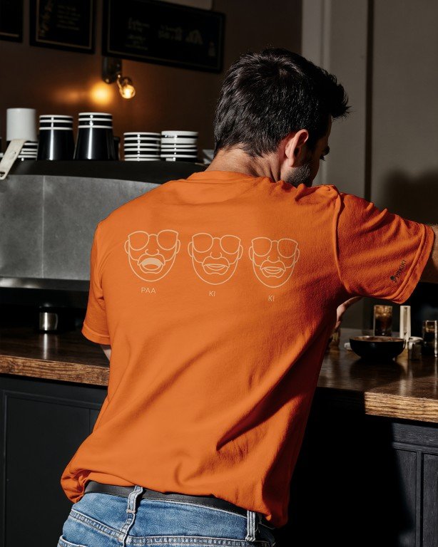
Instead of illustrating this character, the identity abstracts it. The logo is reduced to a few strong graphic cues, circular eyes and a moustache, composed into a simple, friendly face. By stripping the form down, the mark remains bold, legible, and memorable, able to perform clearly across digital interfaces, delivery formats, and packaging.
The visual identity was designed to make trust immediately recognisable. The resulting system balances familiarity with clarity. It feels rooted in everyday trust, yet designed to function at scale within a modern delivery ecosystem.
PAKIKI
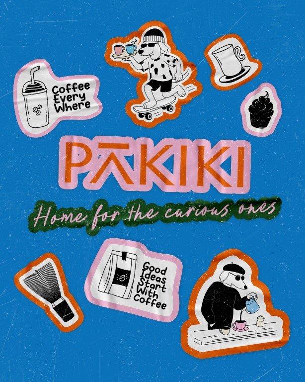
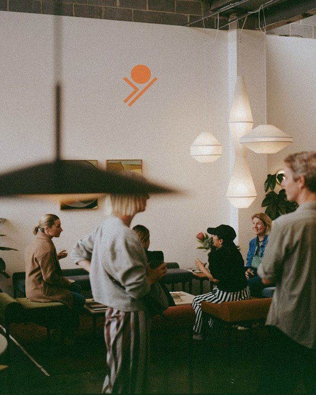
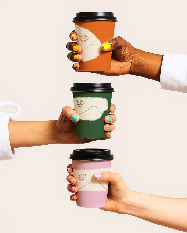
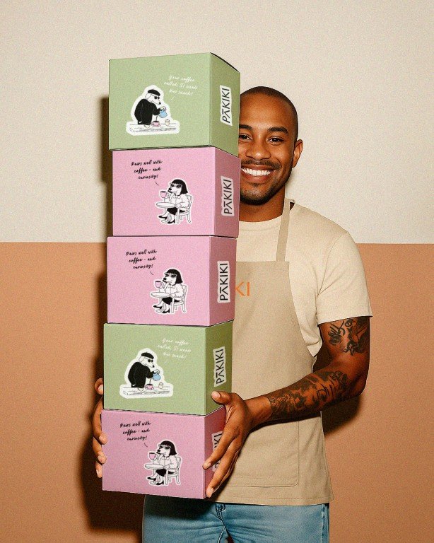
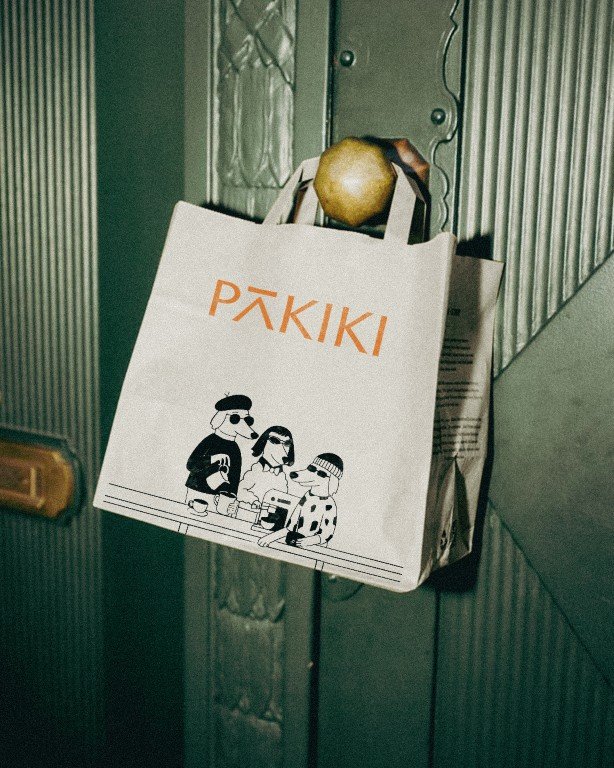
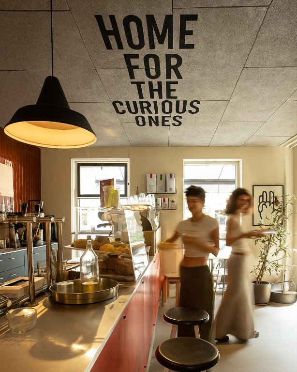
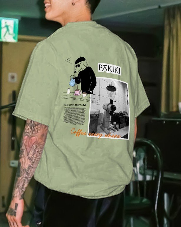
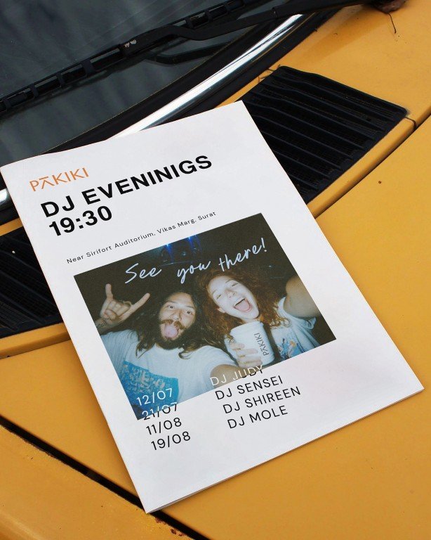
PAKIKI was never framed as just a coffee brand. It was shaped as a third place, one that embraces curiosity, imperfection, and becoming.
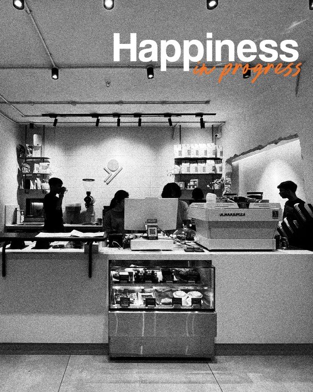
The brand positioning, Happiness in Progress, reframes happiness as something ongoing rather than complete. This idea became the anchor for the identity system. Instead of polish or finish, the brand language stays open and evolving, allowing room for change, participation, and personality.
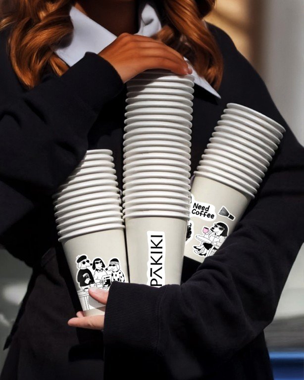
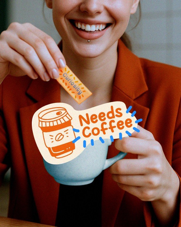
Visually, the identity rejects uniformity. Irregular forms, hand-drawn elements, and loose compositions replace rigid structure. Multilingual wordmarks ground the brand locally, while illustrations and characters introduce familiarity and warmth. Street dogs appear as Paw trons, extending the idea of community beyond customers and into the everyday life around the café.
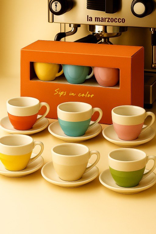
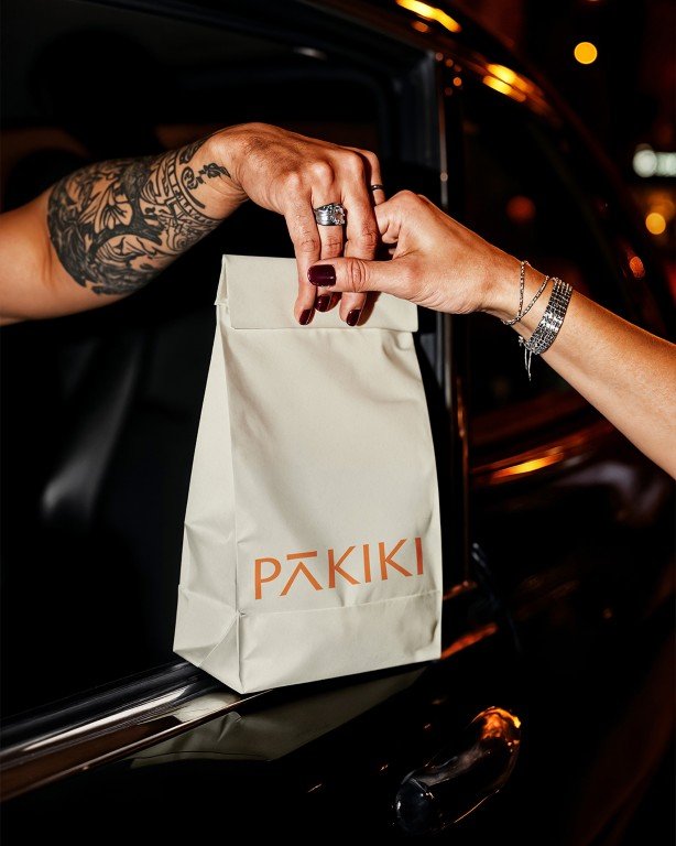
Packaging and touchpoints are treated as part of the experience rather than disposable assets, designed to be kept, reused, and lived with. The tone remains warm, cheeky, and human, reinforcing the idea that progress is imperfect by nature.
The result is a brand system that stays deliberately unfinished, built to evolve with the people who inhabit it.


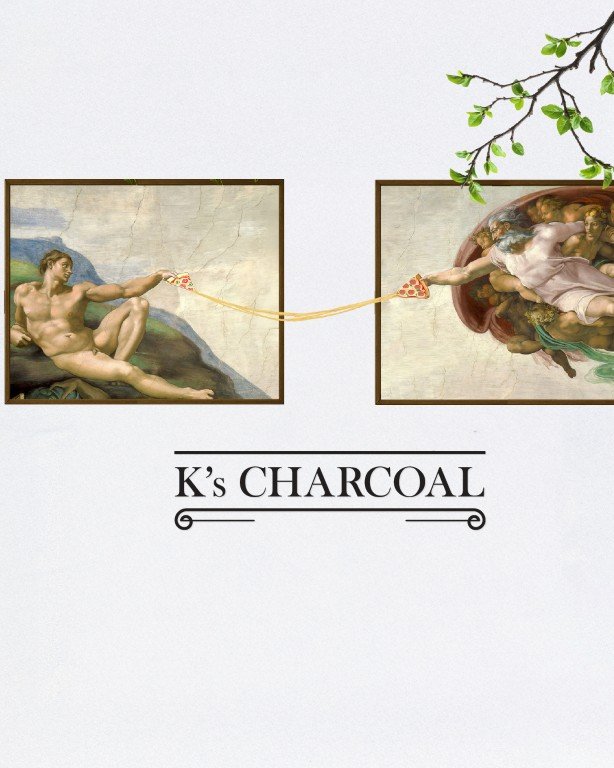
K’s Charcoal
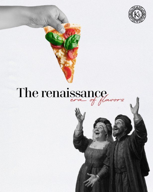
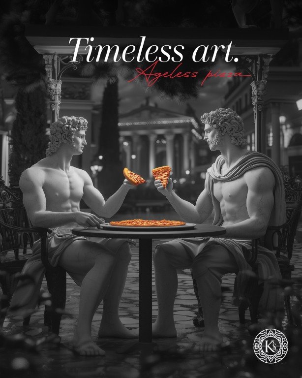
A rebrand and repositioning for a legacy Italian dining experience.
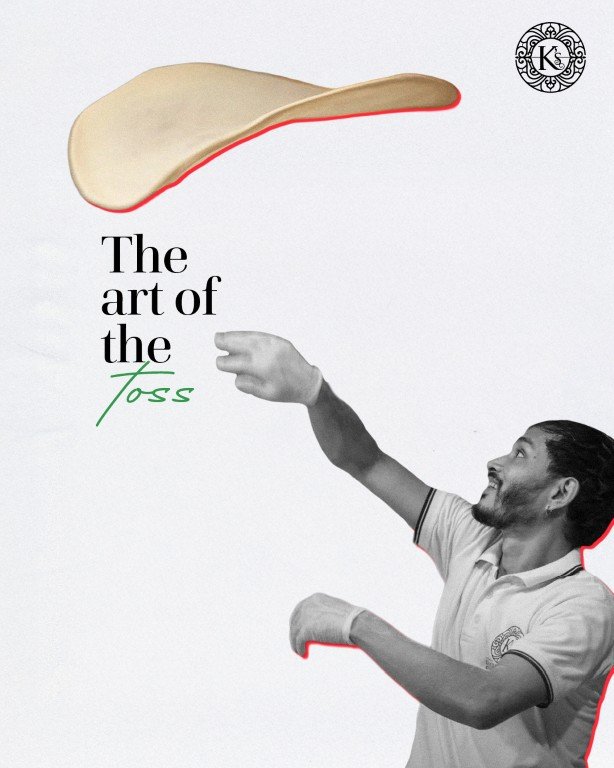
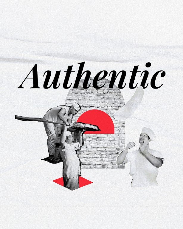
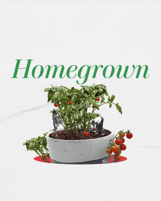
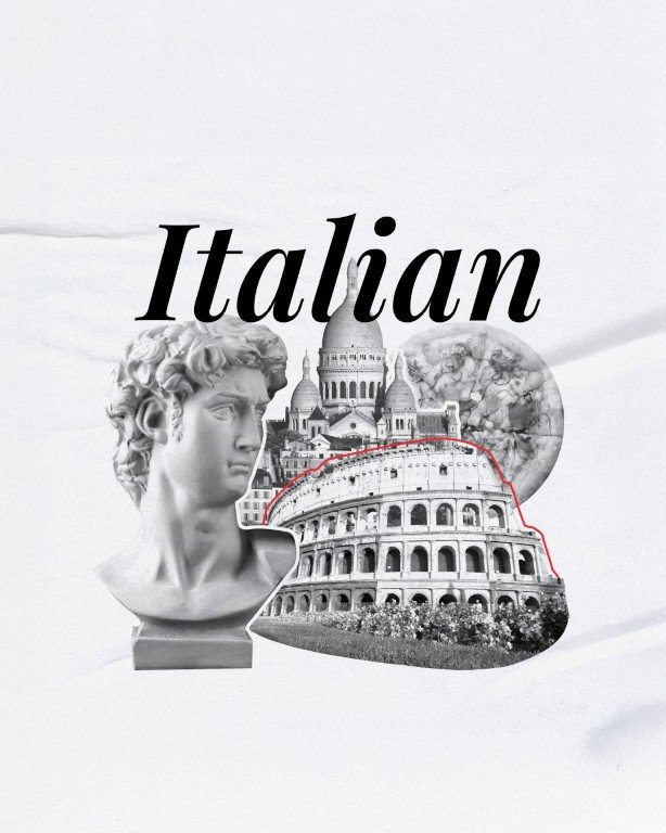
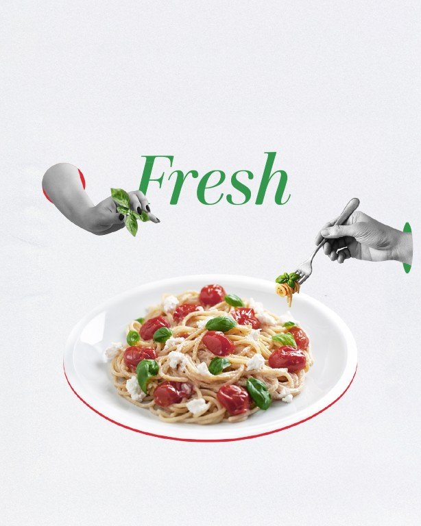
K’s Charcoal needed a renewed brand presence, one that better reflected its commitment to authentic Italian cooking and differentiated it from a category crowded with fast, Americanised interpretations. The existing identity was not doing justice to the depth of craft, process, and philosophy behind the brand.
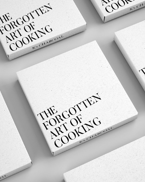
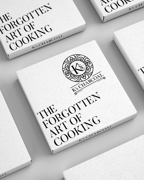
The work focused on redefining the brand from the ground up. Positioning was anchored in The Forgotten Art of Cooking, a return to time honoured methods, slow processes, and honest ingredients. This idea shaped the narrative, tone, and visual language.
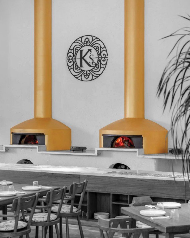
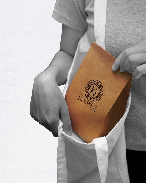
The visual identity draws from classical Italian architecture and symbolism. The logo takes inspiration from ornate Italian gates and grills, referencing heritage, permanence, and authenticity. Typography, colour, and packaging were designed to feel timeless rather than trendy, allowing the food, process, and story to lead.
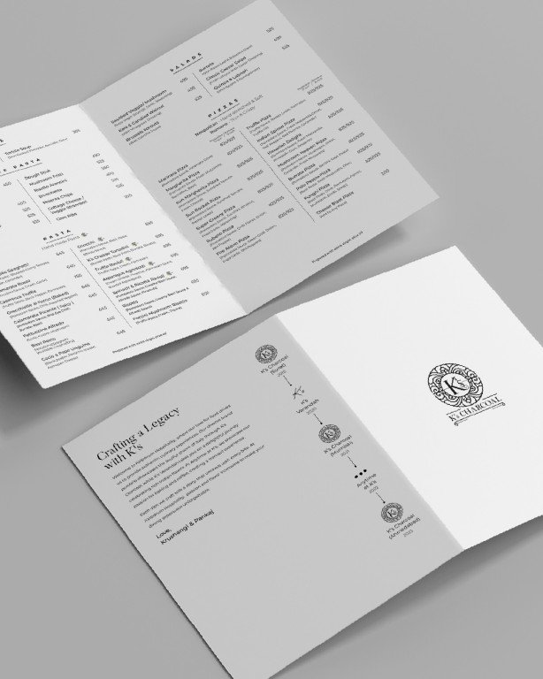
From brand strategy and identity to packaging and in-restaurant touchpoints, the system was rebuilt to feel cohesive, confident, and rooted in tradition, while remaining relevant to a contemporary audience.
K’s Antarvan
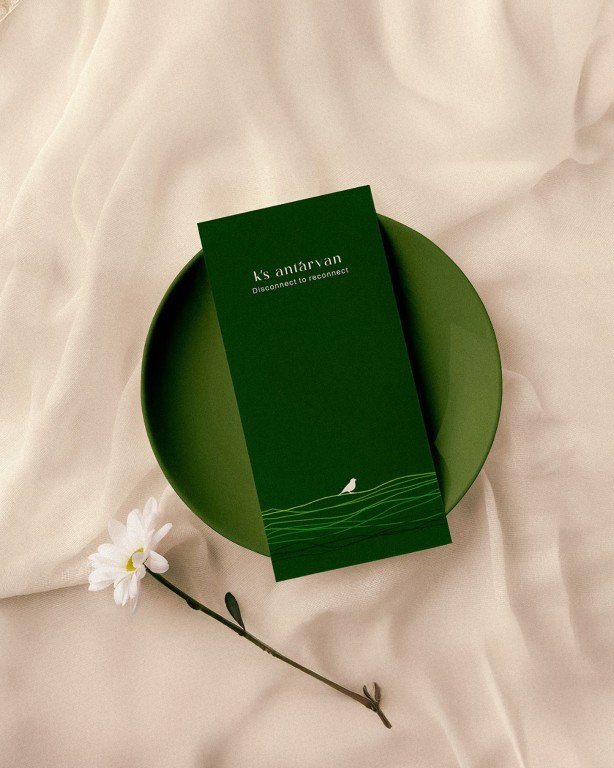
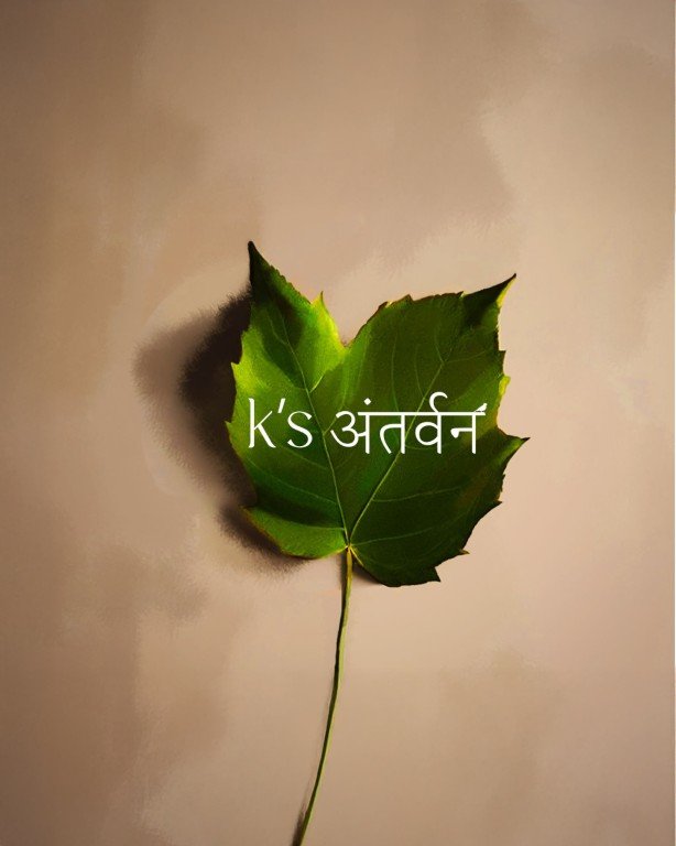
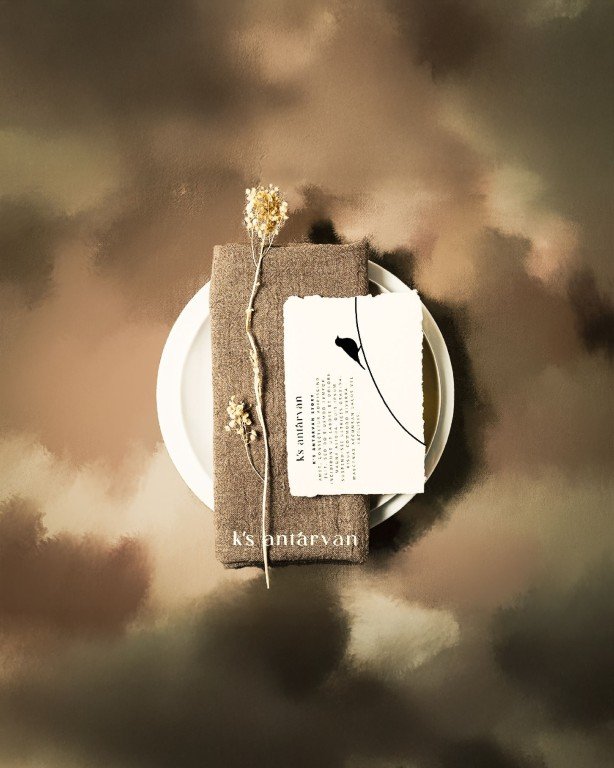
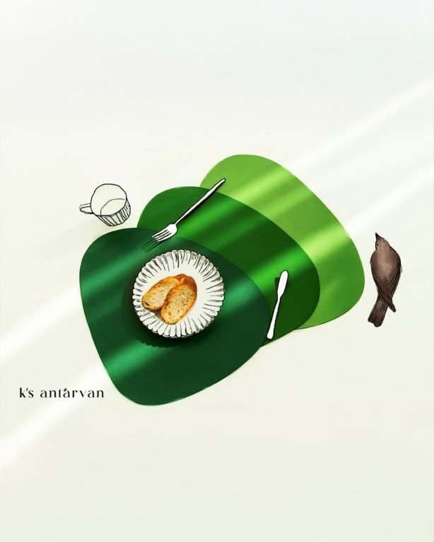
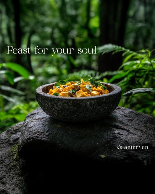
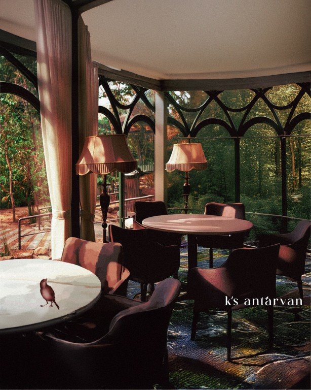
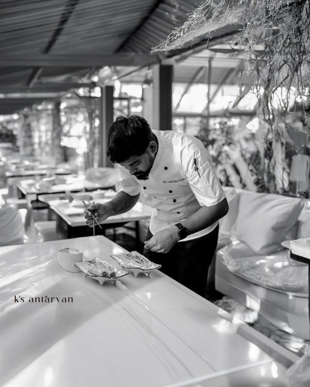
K’s Antarvan is a fine dining restaurant conceived as an elevated, immersive experience rather than just a place to eat. The brief was to create a visual identity that could set the tone for this experience, quiet, refined, and deeply rooted in nature.
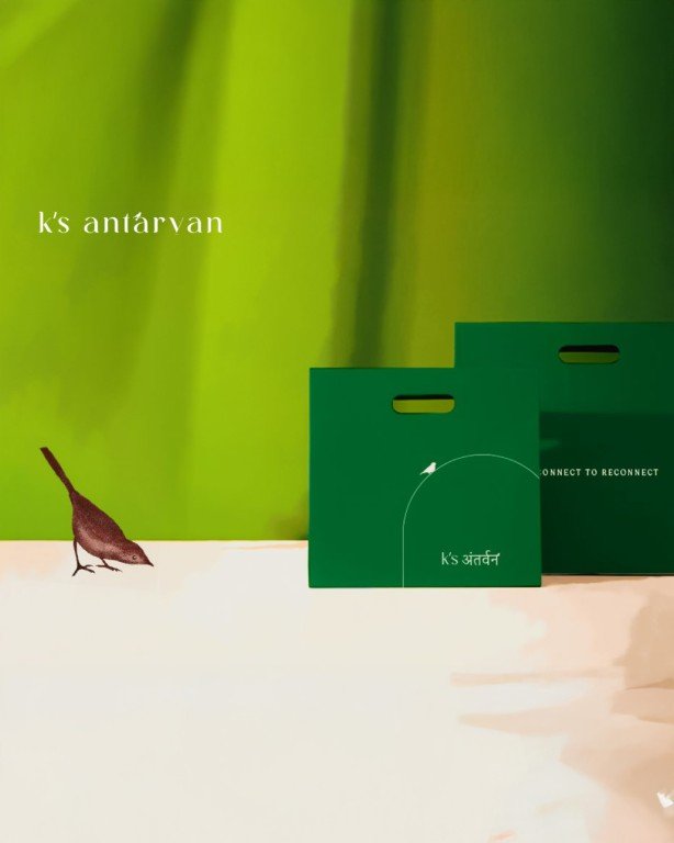
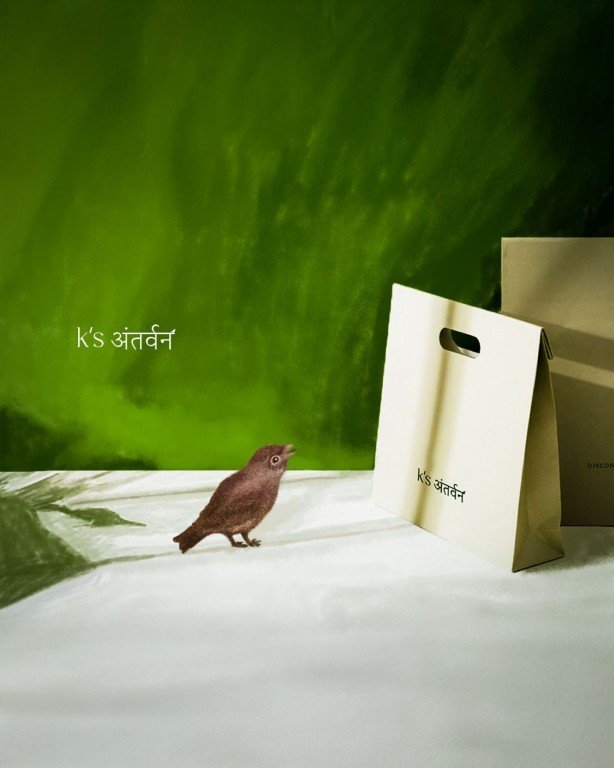
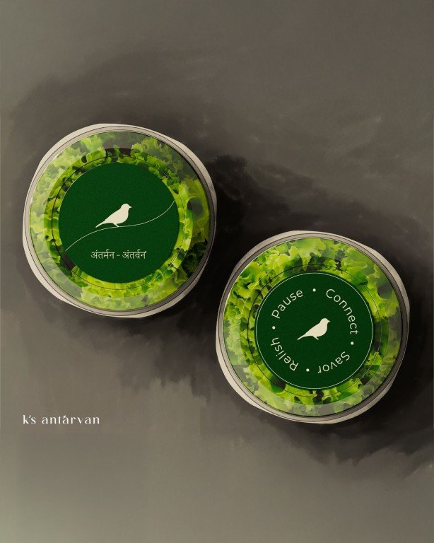
The identity begins with the logo. A sparrow was chosen as the central symbol, representing calm, presence, and subtle movement. Designed with restraint, the mark establishes a sense of serenity while remaining distinctive and sophisticated, appropriate for a fine dining context.
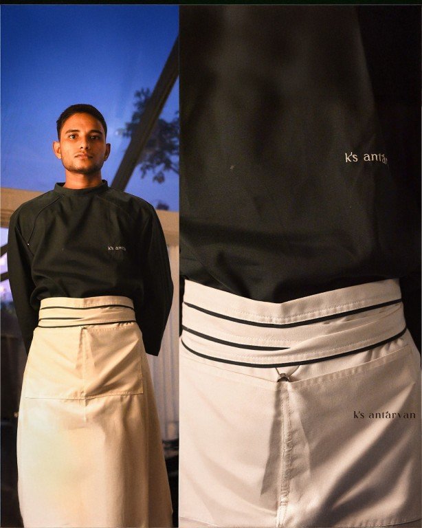
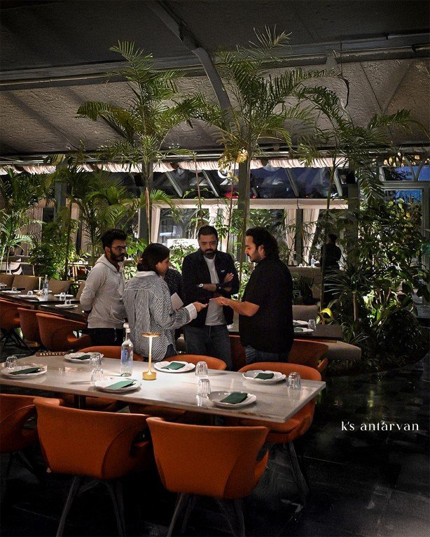
The visual language extends beyond graphics into space. The identity informed material choices, colour sensibilities, and spatial cues, guiding the overall environment toward a feeling of escape and stillness. Rather than treating branding and interiors as separate layers, both were designed to work together as a single cohesive experience.
The result is a brand and space that feel considered, atmospheric, and elevated, where identity does not decorate the experience, but shapes it.